In this post I will demonstrate some basic design skills that I learned in class.
TASK 1
To begin the lesson, my teacher told me to start sketching a minimum of 5 layouts for my front cover magazine in 5 minutes. Here are my sketch results below (the sketches was later used as my rough sketch for my front cover magazine):

┏━━━━━━━━━━━━━━━━━━━━━•❃°•° Self reflection (TASK 1) °•°❃ •━━━━━━━━━━━━━━━━━━━━━━━┓
I find the first task to be extremely time pressuring because I have to complete at least five sketches in a span of five minutes, which means each sketch needs about one minute to finish. I had to finish one sketch quickly because of the time limits. As a result, I decide not to worry about how neat it was, which leads to the messiness of my drawing, including the crooked lines. In spite of this, I still have the time to include the masthead, coverlines, main image, and barcode, which are all of the essential elements of a magazine. In order to make the images recognisable enough to be read, I also added connotations to the ones that I felt weren't visible enough. For me to make an effective composition, I experiment with various typefaces, angle shots of my model, coverline placement, and background colours. Due to this work, it helps me develop my creative thinking in a short amount of time in which I can use this skill in the future when developing ideas.
┗━━━━━━━━━━━━━━━━━━━━━━• ❃°•°❀°•°❃ •━━━━━━━━━━━━━━━━━━━━━━┛
------------------------------------------------------------------------------------------------------------------------------------------------------------------
TASK 2
Next my teacher told me to experiment with some default layouts of a front cover magazine. Then I was instructed to arrange them with the provided template in 10 minutes. Below is the original layout of what my teacher gave:
Here are the result of the front cover magazine layouts I've done:
TASK 3
------------------------------------------------------------------------------------------------------------------------------------------------------------------
Afterwards, my teacher taught the class about the most important basic principles in designing which are: Layout, Hierarchy of type, borders, typeface and colour.
The layout of a design is the backbone that supports the visual elements and content. It involves careful consideration of spacing, alignment, hierarchy, and balance to create a harmonious and visually appealing composition.
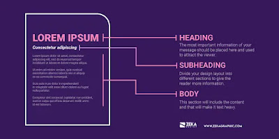
Hierarchy of type plays a crucial role in creating visually appealing and effective communication. This hierarchy helps to create a visual hierarchy that not only enhances the overall aesthetics of a design but also improves readability and user experience.
In order to achieve visual harmony and balance in a composition, borders are necessary. It can be used to crop, emphasize, or decorate the visual aspects of a design. It arranges the user's gaze across the layout and establishes a visual hierarchy in the design.
Typography serves two primary functions in design. The first is to make a design piece more readable, and the second is to aid in conveying the message, tone, and emotion of the design. Aesthetics is another role that typography plays. Clear, aesthetically pleasing designs that are easy on the eyes lure audiences' in.
In order to attract customers' attention, influencing their feelings, and improving usability, colour may also set a brand's tone and image. Finding the ideal color scheme, however, may be challenging and calls for some preparation and experience.
After gaining understanding about the fundamental principles in design, my teacher told us to use these knowledge to apply them and further improve the front cover magazine layouts we've did in task one. Below are my revised cover layouts:
------------------------------------------------------------------------------------------------------------------------------------------------------------------
Typography
Typography is a vital element in design because it enhances readability, sets the tone and conveys the personality of the brand. A good typography guides the reader's eye, making the content more approachable and digestible. Besides that, it is not just about choosing fonts, but also about considering spacing, size, and layout to ensure that the text is not only legible but also engaging as an effective typography can significantly impact how the message is being perceived.
Important terms to know:
- Hierarchy
Used when the reader's eye is directed toward the most significant information of the page. It uses different levels of emphasis to indicate to them where to start and where to move next.
- Leading
The distance, sometimes referred to as line spacing, between text lines. Making the text as comfortable to read as possible is the aim, since the reader may find excessive or insufficient spacing to be bothersome.
- Tracking
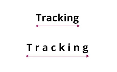
The total amount of space between characters. In certain designs, tracking may be changed to provide a specific visual effect. Correcting typefaces that were initially positioned incorrectly might also be beneficial.
- Kerning
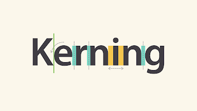
The space between particular characters. It changes throughout the word because each letter fits together differently, unlike tracking. Certain letters appear misaligned when the kerning is done incorrectly.


.png)


No comments:
Post a Comment