Labels

Monday, January 20, 2025

Audience Feedback

This post explains how we showed a rough draft of our music video, album cover, and social media page to some members of our target audience in order to receive helpful feedback. This blogpost is written by all of us together (Chelsea, Kalista, Rara, and Audrey).


The purpose of a screen test is to gain audience feedback about our work and see if there are any improvements that can be made. We decided to use Google Forms to create a survey to share with our audience because of the platform’s availability to collaborate online and allow sharing to others which made it easy for production and distribution. This online platform utilisation is also quick so audiences are more encouraged to engage with our survey.

We divided our questions into sections in relation to different components of our product. 

Here are our questions: 

Section ‘Music Video’:

(Several short snippets from our music video are shown) 

  1. Do you relate to some of the elements in our product? 

  2. What message do you think we are trying to convey from our concept?

  3. What is the most memorable scene from our music video to you? 


Section ‘Digipak’:

(Images of our digipak cover and inspiration pictures are shown) 

  1. Which digipak are you attracted to the most? (1/2/3)

  2. What is the most appealing feature from our digipak?

  3. How likely would you purchase our digipak from its cover design? (On a scale from 1-5) 

  4. What do you want us to include in our digipak? (Lyric book/Artist personal story/Posters/Stickers/Other)


Section ‘Social Media’:

(An image of our star’s Instagram profile is shown) 

  1. Choose 3 words to describe our star “CINTA”

  2. Do you prefer our social media to be professional or intimate? (All intimate/Mostly intimate/Mix of both/Mostly professional/All professional)

  3. How would you like to communicate with the artist on social media? (Instagram live/Interactive Instagram stories & posts/Online meet & greet/Responsive towards comments/Responsive towards DMs/Reposting mentions/Other)


We chose these questions because these servers will lead us to knowing our target audiences better and if our concepts align with what they are expecting and engaging with. We included members of our target demographic in the screen test to ensure that the feedback we receive is appropriate. Finding people for the screen test was easy because we had lots of connections and people who were already anticipating and enthusiastic on our project. We specifically chose our audience to be non-media students in order for us to grasp more feedback from a wider perspective of consumers rather than other producers. We want to understand how our music video appeals to the actual target audience hence we tested it out to other seniors. We had incorporated feedback from previous media students (alumni) on our screen test who had experiences with Media Studies hence they are able to decode elements and our intended meaning to further analyse it.

Here are the drafts that we showed audiences for the screen test: 

Music video (compilation of rough snippets): https://youtu.be/yXV2x3ienro 

Digipak cover sketches:    


Digipak cover inspiration pictures:


Instagram profile:


Google form link: https://docs.google.com/forms/d/e/1FAIpQLSd8Tp1WgTbEH85P17N8IB-LtqTwXZa2-ZnA5NbuWkUMwPpMRg/viewform?usp=header


Here are the RESULTS from the audience feedback:

VIEW LINK HERE

From the feedback, we learned that our genre conventions fit the target audiences that we are aiming for as most of the audiences are able to decode the message that we are implying through our music videos. With teenagers being our main target, audiences now know what they find appealing and interesting in our music video. Moreover, through asking opinions from our audiences regarding the design on digipak, what are the audiences expecting about the content of the digipak, as well as how they want to interact with the star, this helps us in creating a product that is aligned with our target audience's demand


We initially wanted to conform to the pop genre conventions of digipaks as their music albums usually consist of a close up shot of the artist with a plain, colored backdrop. However, after compiling feedback from the participants, we found that they preferred a shot subverting to the conventions. Many of the respondents chose digipak design number 2 which included the artist facing a mirror instead of looking directly at the camera. We understand that our audience wants elements that aren’t conventional as they want something that is new and interesting to them.


This screen test was a useful part of our process because it allowed us to reach our target audience on a personal level. By engaging directly with viewers, we gained invaluable insights into their preferences and expectations. This feedback was key in shaping our creative decisions, ensuring that our final product resonates deeply with our intended target audience. Additionally, the screen test assisted us in confirming our project's vision was relevant and valid by making sure our message and visuals were aligned with and relatable to our target demographic. As our project is still in progress and not fully completed, it is crucial to receive constructive feedback at this stage to prevent incurring extra costs for reshoots and edits after the project is published. This way, we can tackle any issues in advance. 


┏━━━━━━━━━━━━━━━━━━━━━━━━•❃°•°  Self reflection °•°❃ •━━━━━━━━━━━━━━━━━━━━━━━━━━┓


In order to make sure that our message is understood and effectively reaches our target demographic (mainly teenagers), it is very helpful to conduct audience feedback, especially when our project is still ongoing and not yet finished. This allows us to collect comments and feedback on their preferences and expectations. My responsibilities include putting together of the Google Form and taking part in discussions regarding the questions to ask. I had a great time designing the layouts for the questions. It can be difficult to come up with useful questions that will encourage the audience to respond to each one elaborated and efficiently since we need to think of questions that are related to and helpful for our project, but also not demanding a lot of typing or multiple-choice questions. It was easier for us to think of follow-up questions because our teacher gave us some excellent question ideas. My teammates then assisted in distributing the Google Form, to which they also contributed. We used this knowledge to maintain consistency in our branding, knowing that audiences already understand the message we are trying to convey and the way our star will be portrayed. 

After making adjustments based on their feedback, it appears that our social media account stand out the most because of the incredibly high audience engagement rate they receive. Even though it was outside of our aim, I was surprised by the large number of likes and the fact that viewers other than our mutuals would follow and interact with our account (in terms of likes and views). For instance, making interactive Instagram stories with scripted questions is one of the most highly requested audience engagement according to our audience feedback. However, others outside of our team also responded to our question box. This indicates that audience comments had a significant impact on our project's results and audience engagement. 


┗━━━━━━━━━━━━━━━━━━━━━━━━━━━━• ❃°•°❀°•°❃ •━━━━━━━━━━━━━━━━━━━━━━━━━━━┛


My Artist Persona and Brand Identity

This blog post includes me and my group's decision on a persona for our star to be reflected in our products. We did this task together (Audrey, Chelsea, Rara & Kalista). 


Here are some questions provided by my teacher to help us construct an identity for our star: 


Here is my group ideas written in a poster paper

━━━━━━━━━━━━━━━━━━━━━•❃°•°  Self reflection °•°❃ •━━━━━━━━━━━━━━━━━━━━━━━┓

In order to determine how we want to show our main artist to the audience, it is important that we develop our artist's persona and brand identity before executing it. This will enable us to establish a connection with our audience, particularly with our target demographic, and tailor our artist's image and style to appeal to them. My group and I discussed about this in class, so it will be easier for us to all come up with a final idea for our brand identity and artist persona. I took on the responsibility of handwriting every word on the poster and taking part in the discussions as well, which isn't a burden for me because I enjoyed doing both. I suggested developing a spider web layout, which works well since it makes it simple to arrange our brainstorming thoughts around a central topic and makes them easier to understand. Other than that, I differentiated the main topics covered by using various colours, arrows, and bullet points. Furthermore, we decided to just include the most important points on this poster so that we could quickly review what was written without having to read the entire paragraph again. Since we were well prepared with this persona, I believe it would be easier for us to execute, especially since our main star would not be overburdened and we will all save time and research because our chosen cast already possesses those attributes.

┗━━━━━━━━━━━━━━━━━━━━━━━━━━━• ❃°•°❀°•°❃ •━━━━━━━━━━━━━━━━━━━━━━━━━━━┛

Research: Branding

This blogpost will revolve around our branding research, which helps us understand deeper how a musical artist’s brand is perceived and helps us to identify opportunities and make strategic decisions for our main star (Cinta Kyle). This blogpost is written by me (Chelsea), Kalista, Rara and Audrey, collectively as a group.

The artist we choose for this branding is Sabrina Carpenter.

Our Media Studies teacher required us to find examples of their;

  • Social media 

  • Music albums

  • Music videos

  • Magazine shoots/interviews

And analysed the artist’ branding strategy and image with a few questions to answer.


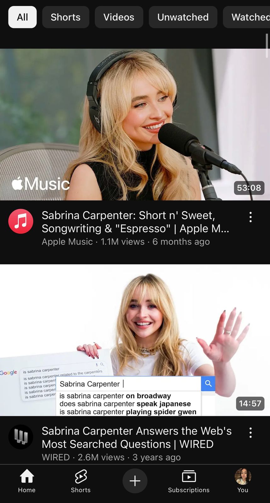
Here is what we found about Sabrina Carpenter.

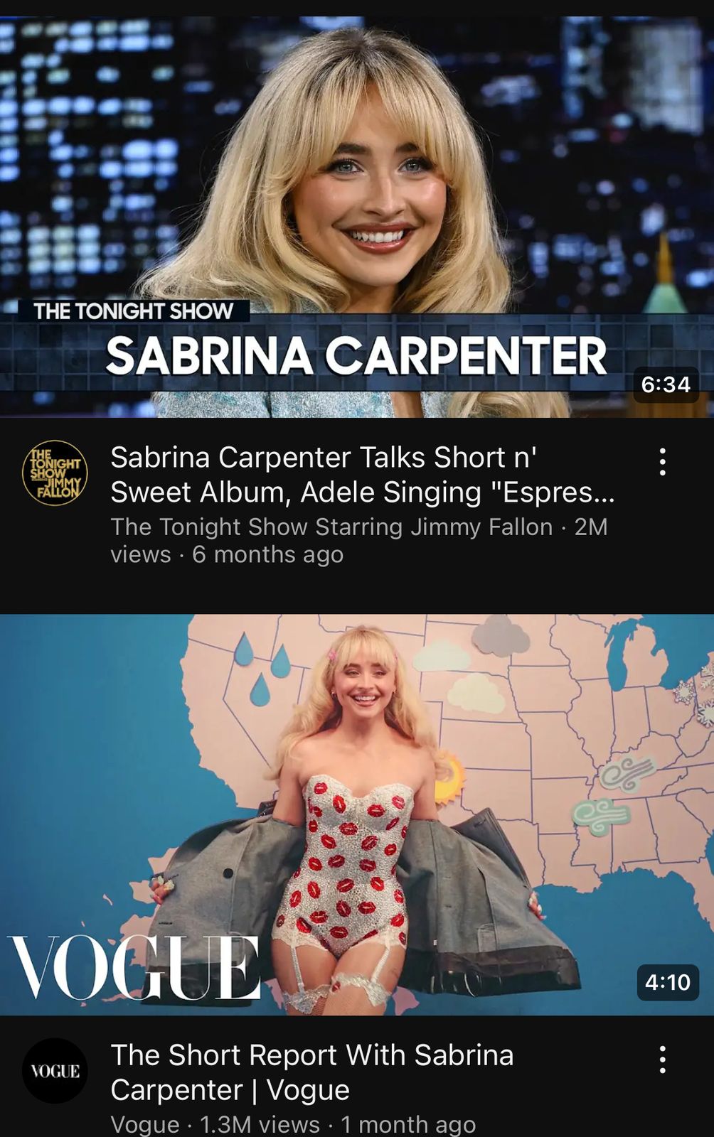
Youtube


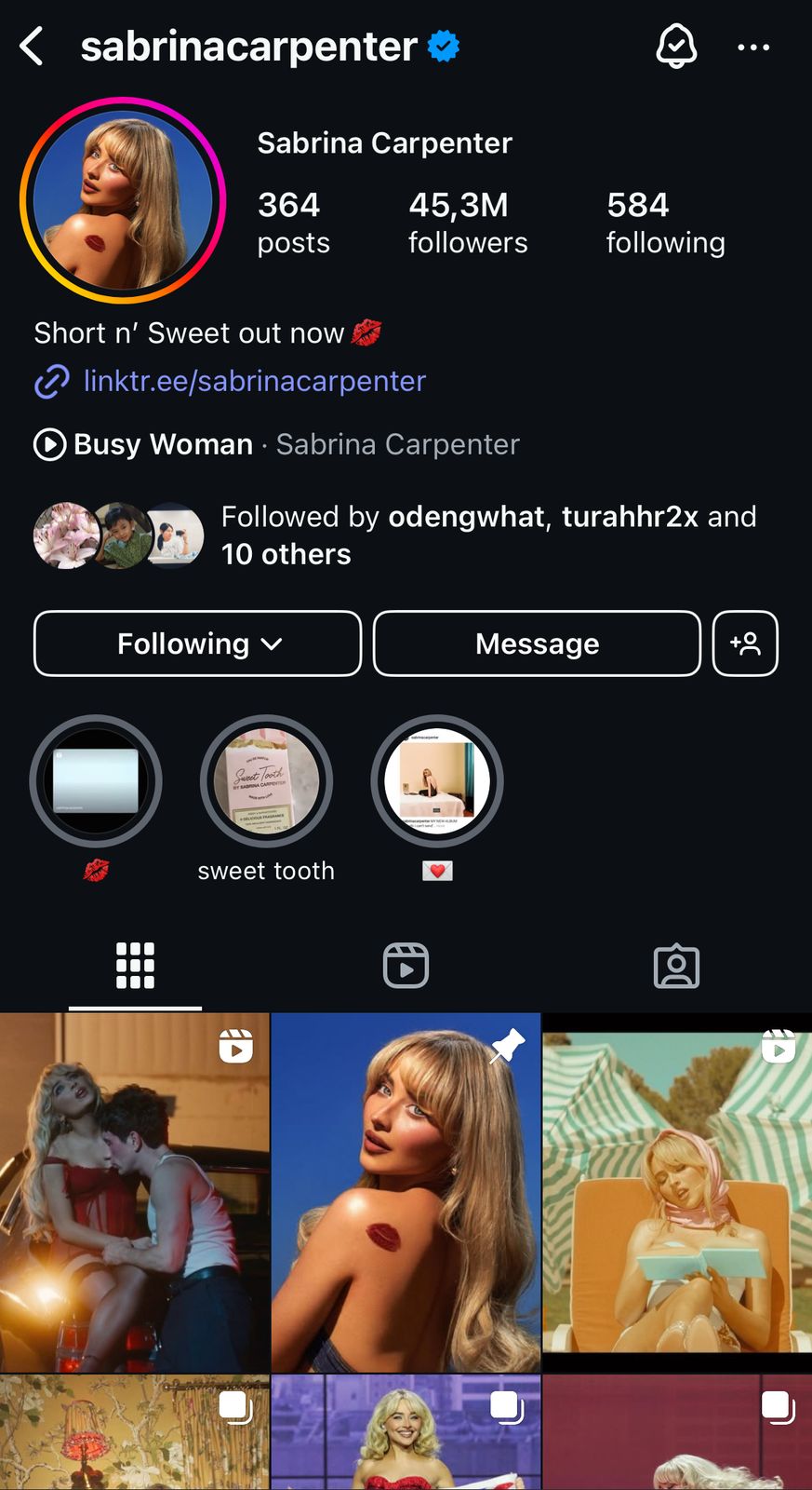
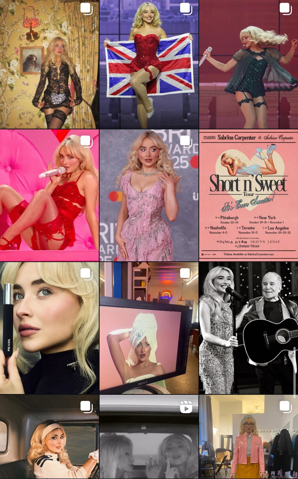
Instagram


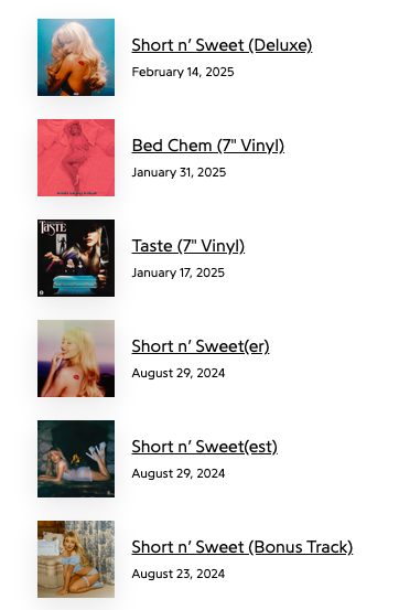
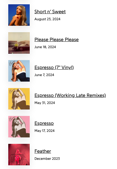
Albums:


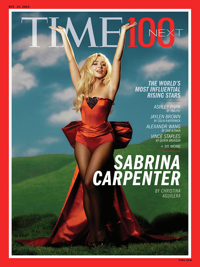
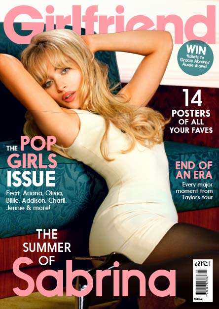
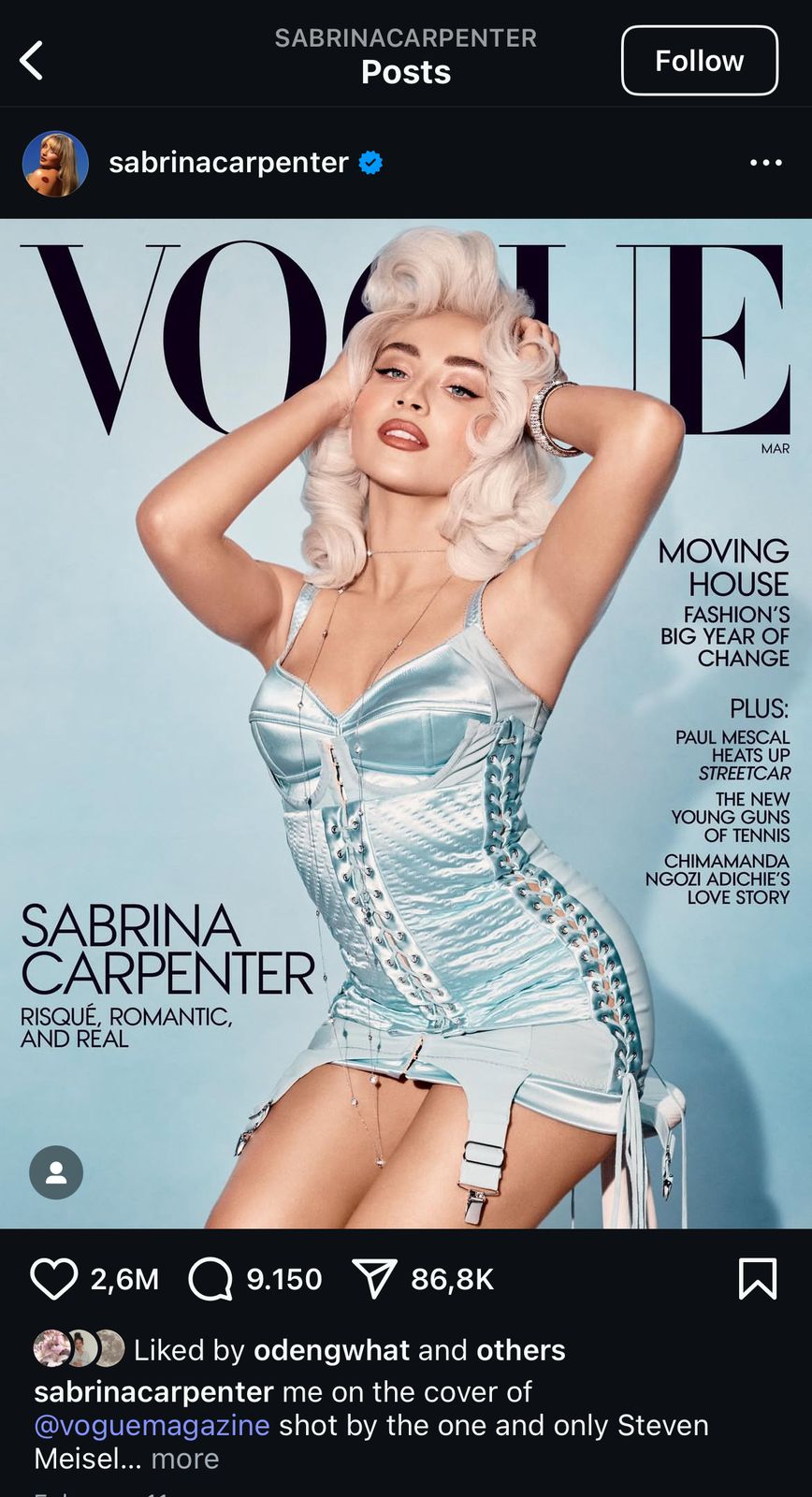
Magazine covers: 


Interviews: 


Concerts: 


What brand identity are they giving off?

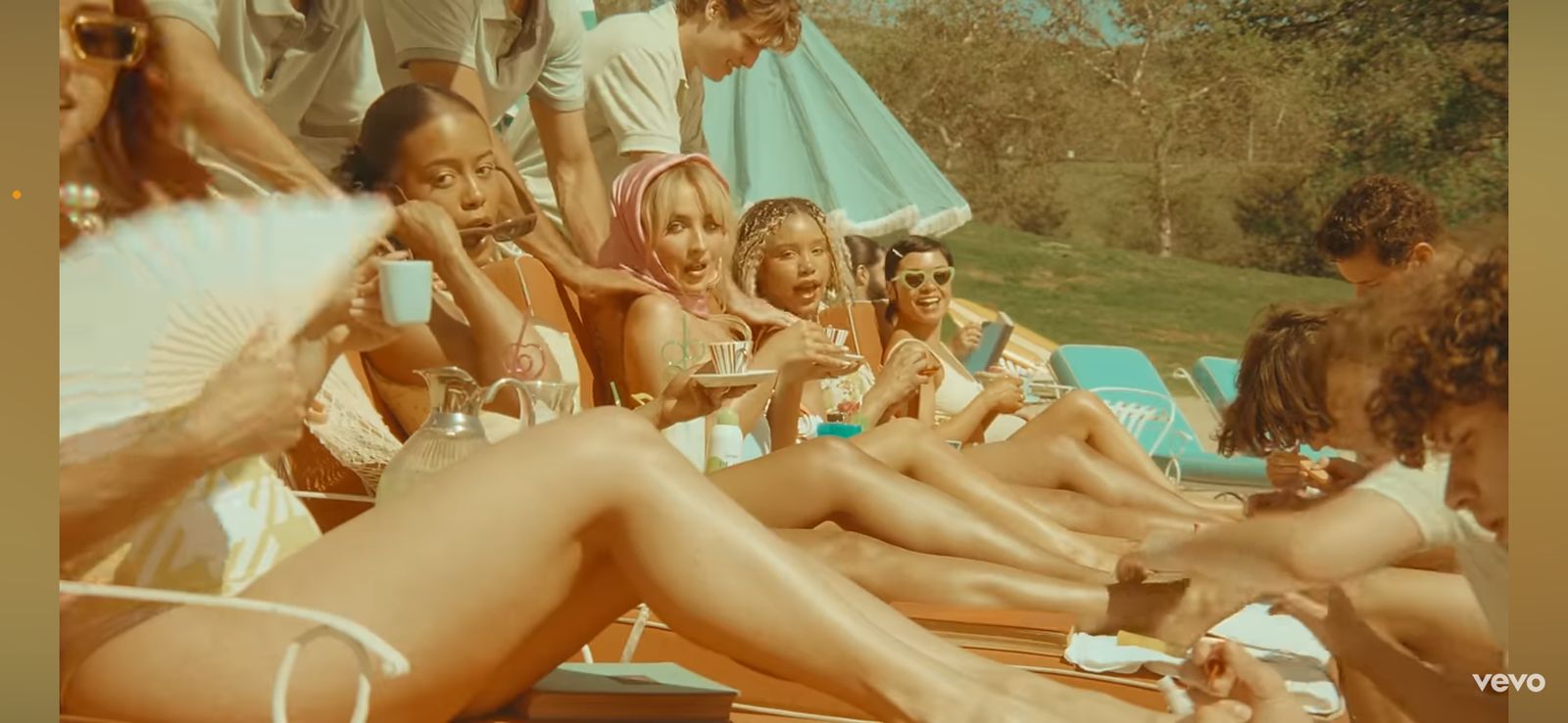
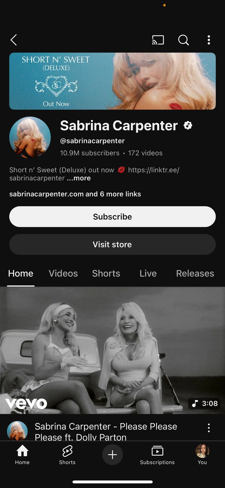
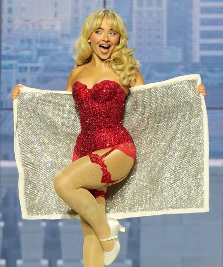
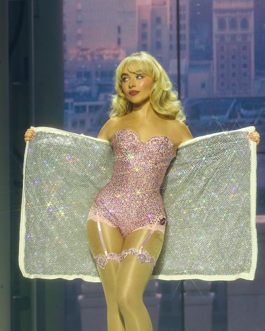
Sabrina Carpenter’s identity is more girly incorporating lots of pink, red, and things that are associated with kisses. This gives the illusion that she's more of a feminine artist with her over the top outfits (sexy) throughout different media products, it builds an image that she's a global style icon as most of her outfits go viral on the internet. Especially in her albums and Instagram, she has built an identity with the colour soft blue, where we can see her most popular album ‘Short n' Sweet’ uses a blue backdrop and another song called ‘Espresso’ using a light blue backdrop it allows audiences to associate the colour blue with Sabrina almost making it her trademark. Furthermore, other mise-en-scene elements such as Sabrina's hair, makeup and outfit has been kept constant throughout her whole music career as she's known to use glowy makeup with lots of blush, iconic blonde volumized blowout which shows audiences that this is her brand image and it has been kept the same throughout her new albums. 


What is their personality? 

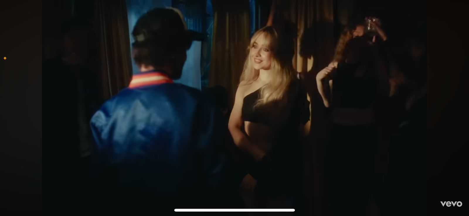
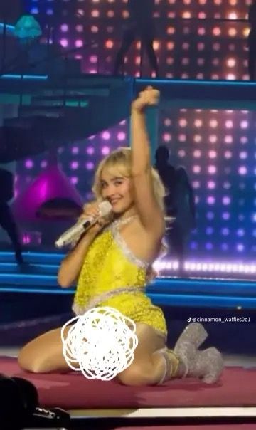
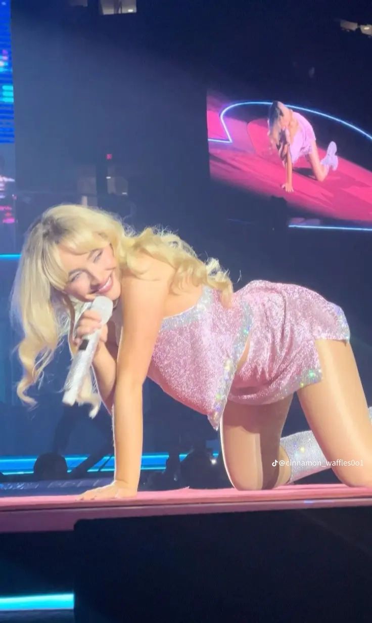
Sabrina Carpenter builds an empowered yet mischievous femininity by incorporating glittery outfits in soft pastels and romantic cuts with strong stage presence. In other pictures, her poses and expressions centre on female agency within the music industry, and challenge the notion of passive female representation. Another thing is that, Sabrina Carpenter curates a carefully crafted image embodying her youthful charm, fashion-forward style, and playful personality on Instagram. Her feed, a combination of editorial-quality shots and casual behind-the-scenes moments, has a funny and relatable energy that is still elevated. She often taps into nostalgic aesthetics, Y2K-inspired dress and pastel color palettes, which gives her a visually signature pop aesthetic. Her engagement strategies include: behind-the-scenes or personal stuff that gives fans a connection, touch of humor and self-awareness in captions that complements her relatable persona. Additionally, for music video persona, Sabrina combines playful with edgier tendencies. In Feather, for instance, she utilizes bold, pastel visuals crafting a persona who is both untroubled and in complete possession of herself. Likewise, in Nonsense she leans into a flirty, cheeky vibe, doubling down on her brand as playful, fearless and confident. What we can learn from her branding is that her brand lives in a space between femininity and confidence, where cute aesthetic finds a home with playful lyricism and audacious storytelling. cinematic storytelling, she aligns cohesive themes through her music videos and across her social media to maintain brand consistency. As well as, her activeness on Instagram through fun comments, personalized posts and such allows her to engage with fans on a personal level.


What image are they creating for themselves, how? 

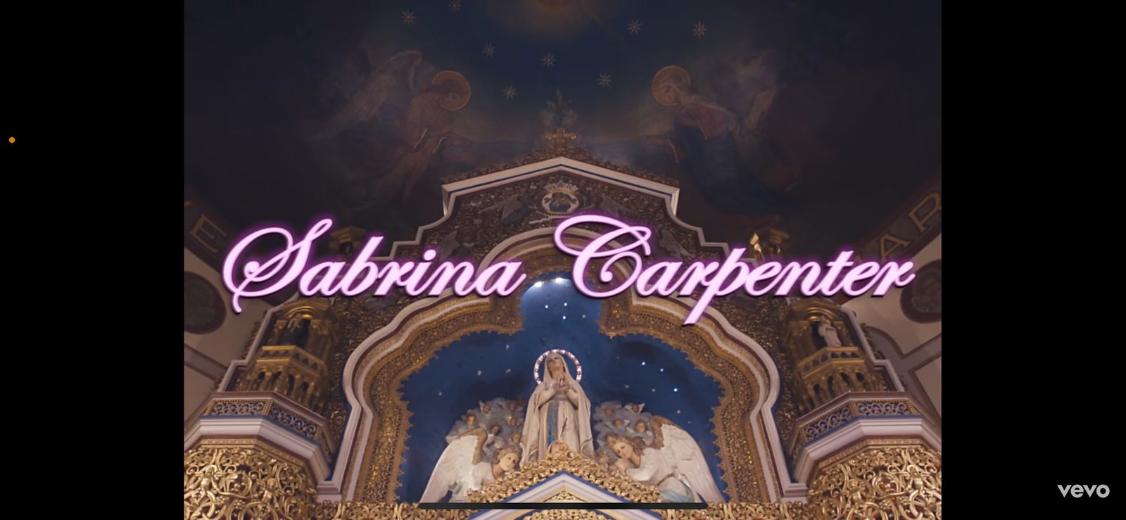
Three things that are associated heavily with Sabrina Carpenter’s image are cheeky, flirty, and vintage. Firstly, Sabrina Carpenter creates an image that is associated with vintage, old Hollywood, and retro style conforming to the traditional conventions of women. Her reel persona relates to Hollywood glamour from her social media marketing, concerts, and outfits as her inspiration mainly comes from the 50s-60s aesthetic. Her advertising and social media presences mainly consists of fonts and typefaces from 50s-60s newspaper or  movie poster and VHS overlays. Her iconic look showcases her vintage-inspired attire and channels old Hollywood pop icons such as Marilyn Monroe which we can see that she was represented through the bold, red lipstick and blonde curly hair. Second, her flirtatious image is conveyed through meanings and themes of her songs, exploring mature themes of love. Moreover, this could be a development from her image as a Nickelodeon child star into a mature pop icon. Her outfits and make-up looks bring up a very feminine look on her concerts, interviews, social media presence, and many more. Lastly, her image as a pop icon is cheeky as her persona reflects how she is a very friendly artist from increasing engagement and connections with her fans. She is very easy-going as reflected on social media. Moreover, the usage of colorful clothes at her concert may connote playfulness.


How do they speak to their fans?

Through her music videos, she uses narratives that connect to her female audiences more such as love, being hung up on a guy or even showcasing men treating women like a princess in her “Espresso” album. It allows audiences to connect more with the artist as they will believe it will resonate with their real experiences or desires in life. While in social media, she reposted many stories of her fans reacting or lip-syncing to her new albums indicating that she watches the content her fans post, making audiences feel a deeper connection with the artist. And in order to keep her audience interested in her next shows or concerts she creates a certain element of surprise her audiences look forward to in each show. In this case her outfit that she's wearing for each show is different depending on which city she's performing at, with a towel covering the outfit until she shows the grand reveal before starting her first song. With each performance that she showcases the song “Juno” she adds a certain pose with the saying “have you ever tried this one” making audiences wonder what pose she's going to do in her next show, keeping audiences at their feet as they want to know what other surprises she has set in place for them. She also uses a lot of informal writing with emoticons such as “neowww” & “thank you :’)”. By speaking informally she gives her fans a sense of familiarity as she also directly consumes and replies to content her fans make, fostering a bond with the artist and audience. 


What visuals link all of the media products together?

In her media products multiple elements are used to create an identity specifically towards the artist. One of the most obvious is her choice of colour, pose, clothing and typography. These 4 elements are used throughout all her products: social media, music video, album, interview, concerts. In her music videos she mostly uses a vintage tone colour, fonts from the 50s that are in newspapers or movie posters with her pose being mostly flirty and showy and this is used throughout all her media products as it keeps her identity consistent allowing audiences to easily recognise her. It creates a feeling of nostalgia as she incorporates both modern trends with old Hollywood glamour but it mostly shows heavy emphasis on old fashion trend such as her 90’s hair blowout making audiences feels amused of how Sabrina is trying to bring back past trends while incorporating her own unique ideas such as personal kiss marks and letters in her digipak giving a sense of personal touch to her audience, connoting a flirty, bold and sexy demeanor of the artist. As she constantly pushes this idea her audience already recognise this to be Sabrina’s style as an artist because all her products theme flow well with one another as she mixes both 90’s and modern styles together creating her iconic PERSONA. In addition to that her over the top looks can be seen from her mise-en-scene such as her makeup and outfits that stays the same in all her concerts, interviews, and music videos. She uses clothing that is sleeveless that mostly shows her shoulders and legs indicating the sexy vibe she's aiming for, while her hair is always kept the same, an iconic 90’s volumised blowout with bangs. It leaves an impression that Sabrina is the “IT” girl always looking on point fully dressed to any event, allowing audiences to focus on the fact that Sabrina is someone they get inspired by. All these repeatedly used elements altogether shows her audience that she's building a brand identity that stands out as someone that is confident, indicating her being the “IT girl” of her generation making her stand out more than other artist. 


How could this artist influence you?

Sabrina Carpenter is one of our main inspirations for our branding as her consistency in upholding her image is top-notch. Carpenter’s identity as a former childhood Nickelodeon star was immediately unrecognised as her brand identity changed completely which was due to the consistency of building up a new image. We want to follow a great consistency in building our star’s brand in order to convey a clear interpretation of our star’s person by using a certain theme and color to uphold in every social media presence. Carpenter’s old Hollywood aesthetic had been consistently used in her music videos, social media campaigns, and concerts. We need to create a certain theme to follow for our star so posts and social media presence could follow and maintain this image. Moreover, Sabrina Carpenter is very feminine which we may tell from the symbolic usage of red lipstick and kiss marks. We are, especially, inspired by the kiss marks which are vital for her image and creates a symbol to represent who she is as a pop artist. We want to incorporate this element in our braiding as our target demographics are similar to Sabrina Carpenter’s. 


┏━━━━━━━━━━━━━━━━━━━━━━━━•❃°•°  Self reflection °•°❃ •━━━━━━━━━━━━━━━━━━━━━━━━━━┓


In my opinion, branding research is super important since it enables us to comprehend our target audience, figure out how to set our star apart from competitors, as well as developing a strong and recognisable brand identity. We chose Sabrina Carpenter for our branding research not only because she is a pop star and have similar target audience to ours, but because we believe that it takes her a long time to develop as a successful artist before she succeeds in creating a strong, consistent brand that sets her apart from other pop artists. From this, we could use her ideas as inspiration for our own project to successfully develop a brand identity and consistency across all of our products, as well as to better understand and connect with our target audience. I personally enjoyed writing this blog post because I've always been interested in how artists use branding and marketing, and Sabrina Carpenter's genius branding is particularly inspiring to me. I wish I could have done more research on other pop artists, but given the time limits and other things that needed to be done, we believe that this in-depth analysis of Sabrina Carpenter is sufficient. 


┗━━━━━━━━━━━━━━━━━━━━━━━━━━━━• ❃°•°❀°•°❃ •━━━━━━━━━━━━━━━━━━━━━━━━━━━┛

Monday, January 13, 2025

Classwork: Multicam Editing

Here is the work I did on how to edit with multiple cameras. My group and I filmed the footage, but I edited it myself. My teacher provided a template for the blog post. This blog post is completed by me (Chelsea).

What is Multicam Editing?
Multicam editing is the process of editing footage of a single scene or subject recorded from different cameras and angles. Showing the same scene or subject from different angles helps make the video more dynamic and visually captivating for your audience.
Shooting
Our subject, a classmate, stood in the center of the room and did a short performance. My group stood around the subject to record the performance from different angles. You can also see members from other groups because we did this lesson as a class. To make it easier to synchronise our cameras, the teacher clapped at the start of the scene. This allowed us to line up the video in the editing process and ensure that the transitions would be smooth. Without this simple action it would have taken a lot longer to sync the videos. 

Behind the Scenes 


Our teacher took this picture when we were conducting the filming: 


Our teacher also did a short lesson on how to edit multi-cam for us to follow:

Here are the raw videos from my group members:
Video 1 (Kalista - Low angle)
View link (in case it is unaccessible) here

Video 2 (Audrey - High angle)

View link (in case it is unaccessible) here

Video 3 (Chelsea - Long shot)

View link (in case it is unaccessible) here

My editing process:

View link here


Here is my final edited video:


┏━━━━━━━━━━━━━━━━━━━━━━━━•❃°•°  Self reflection °•°❃ •━━━━━━━━━━━━━━━━━━━━━━━━━━┓

In the end, this technique would be beneficial for editing since it would contribute to a scene's meaning, information, and immersion. Since I will be likely be the project's editor and we will likely shoot scenes from different angles, this practice helped me determine which editing technique works best so that I can efficiently and smoothly edit multiple cameras. I discovered that reducing the opacity would be preferable than deleting a clip because, in the end, it does not appear very good or smooth. I can just simply switch between shooting angles and adjust the opacity settings, whereas removing them will require me to upload the file again. I can edit on both my phone and laptop, but for this particular task, I think my laptop was easier because I am already used to the controls. This will help me improve my editing abilities because I think I will be utilising my laptop as my primary editing device for our future project. Additionally, I believe that wearing earphones is quite helpful because I have to pay close attention to the song in order to keep the scene's duration in sync with the beat; otherwise, it would be off beat. I also liked the fact that we could edit using any music. Since I liked this song, I also enjoyed editing it.

┗━━━━━━━━━━━━━━━━ ━ ━━━━━━━━━━━• ❃°•°❀°•°❃ •━━━━━━━━━━━━━━━ ━ ━━━━━━━━━━━━┛