Here is my double page spread research & development layout.

┏━━━━━━━━━━━━━━━━━━━━━━━━•❃°•° Self reflection°•°❃ •━━━━━━━━━━━━━━━━━━━━━━━━━━┓
Creating a double page spread was a huge challenge for me because I’m still not sure which type of layout to use after all the research I've done. The use of grids and borders took me a long time to adjust so I had to cut out some of the article contents in order to fit all in and make sure it doesn’t have too little or too much of text for the audience to read. I needed to experiment with many different possible layouts, color scheme, as well as the type of typeface and text alignment which would suit my magazine genre and theme. The negative space below the page was also really poor to my liking. Overall, I’m still not quite satisfied with the results of my double page spread due to the limited time I have and hopefully I can revise it as soon as possible. For my second attempt, I actively asked my friends and teachers for constant feedback and honest comments. By this, I am able to collect unbiased data and further improve my designs so that the final result will look appealing for both myself and the audience reading my double page spread article. Due to changing my layout do a more structured format, the use of borders and margins has aided my designs to appear more professional and neat as the texts are aligned tidily.
┗━━━━━━━━━━━━━━━━━━━━━━━━━━━━• ❃°•°❀°•°❃ •━━━━━━━━━━━━━━━━━━━━━━━━━━━━┛
Here is my research for my double page spread magazine:
--------------------------------------------------------------------------------------------------------------------------------------------------------------------------------------------------
Draft sketch
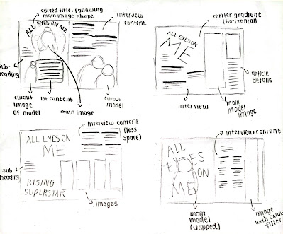
Below are the sketches for my possible double page spread layouts:
--------------------------------------------------------------------------------------------------------------------------------------------------------------------------------------------------
Development
After my research, I began developing my page:
VERSION 1
Here is my attempt in removing the background of my main image:
Background used:
After cropping out my model image and choose the background, I started on designing my double page spread
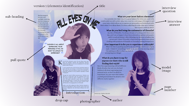
Double page spread version 1 analysis
I am not satisfied and not confidence with the results of my first version of this magazine due to several reasons:
- Poor colour scheme, it makes the whole design look unprofessional
- The filter chosen for my model images made the whole page look dull
- Article content are not justified and not following the margin and borders, which makes the position of the text messy
- Poor choice of typeface used, too many styles are used
- Overall looks really rushed
I will try to create another version of my double page spread, but this time I will pay more attention to the colours I will be using, borders & margins and the typeface choice. I decide to not add too many elements in the page so that it is easier to read.
════ ⋆★⋆ ════
VERSION 2
Final double page spread design:
════ ⋆★⋆ ════


No comments:
Post a Comment