Monday, January 29, 2024

𝐏𝐡𝐨𝐭𝐨𝐬𝐡𝐨𝐨𝐭

 Here is a compilation of pictures during my photoshoot.

┏━━━━━━━━━━━━━━━━━━━━━━━━•❃°•° Self reflection°•°❃ •━━━━━━━━━━━━━━━━━━━━━━━━━━┓

Creating this blog post allow me to know what to prepare beforehand so that during the photoshoot there is no need to require extra preparations. My sister (the model), has already agreed and has consent to become the model for my magazine. However, during the photoshoot day she was reluctant at first because I wanted to do the photoshoot in the morning due to better lighting. I cannot force her otherwise I won’t achieve the best result for the photo taken (such as poor expression due to the model being in a bad mood). Hence, I had to wait until the afternoon for her to be ready which means that I won’t be having many time to do extra shots if it’s necessary. Additionally, I needed more people for the hand holding phone prop, so I asked my other family members if they're willing to do so and they agreed. I was also afraid of the limited photography equipment because there isn't a professional camera around me, so I have to rely on using my phone and editing to improve the quality of the photos I capture. I was initially concerned and worried because I also ran into issues with the lighting quality during my first attempt, this is because I didn't use a flash. So, for my second try, I tried utilizing the flash and was relieved that it worked out better. Overall, I felt that this photo shoot was enjoyable, and both my model and I were having fun while capturing the shots.

┗━━━━━━━━━━━━━━━━━━━━━━━━━━━•   ❃°•°❀°•°❃   •━━━━━━━━━━━━━━━━━━━━━━━━━━━┛


PRE-PHOTOSHOOT

Face appearance 

Makeup time-lapse video file (click here to view) 

This is a quick time-lapse video of me doing my model's makeup. Given that my model is still quite young, I want to create a look that is simple, elegant and natural. In addition, because young teenage girls are my target audience, I want to create a sense of creativity but also maintaining innocence in my model for my target audience to be inspired by. 

Outfit 

Star baby tee + black & white plaid pants 


I deliberately chose this particular outfit style because I want to keep up with current trends in fashion that appeal to and engage younger teenage girls, particularly those in Generation Z. The choice of black and white may conveniently contrast with nearly any background, and I don't want any complex or overly brilliant colors in the clothing to make it more approachable and relatable to the viewer.

Props used 

I would like more than one phone to be utilized as a prop, where only hands and the phone camera are shown as if a paparazzi would take photographs using their cameras, because I want to create a paparazzi feeling for my front cover magazine. 

Furthermore, I experimented with several items for my model to hold or, such a polaroid camera and glasses. When my model is posing with them, I can utilize the polaroid camera to showcase her personality and add context to my images, which will make them more captivating. Initially, I wanted to use the black sunglasses that celebrities typically wear to avoid being photographed by paparazzi because they are too bright. However, I was unable to find that particular prop, so I tried using clear glasses that my model could wear and try different poses with. In the end, this worked out and turned out quite okay.


POST-PHOTOSHOOT

Below are the raw, unfiltered images I took during the photoshoot process for my magazine:

1st attempt without flash (car backseat)

2nd attempt with flash (car backseat)


Other medium / close up shots used 

Selfie shots


After the photoshoot session, I tried to evaluate the pictures and decide on which one I will most likely use for my magazine: 

Wednesday, January 24, 2024

𝐃𝐨𝐮𝐛𝐥𝐞 𝐏𝐚𝐠𝐞 𝐒𝐩𝐫𝐞𝐚𝐝 𝐑𝐞𝐬𝐞𝐚𝐫𝐜𝐡 & 𝐃𝐞𝐯𝐞𝐥𝐨𝐩𝐦𝐞𝐧𝐭

Here is my double page spread research & development layout. 


┏━━━━━━━━━━━━━━━━━━━━━━━•❃°•° Self reflection°•°❃ •━━━━━━━━━━━━━━━━━━━━━━━━━┓

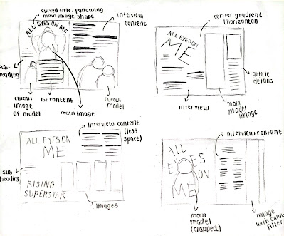
Creating a double page spread was a huge challenge for me because I’m still not sure which type of layout to use after all the research I've done. The use of grids and borders took me a long time to adjust so I had to cut out some of the article contents in order to fit all in and make sure it doesn’t have too little or too much of text for the audience to read. I needed to experiment with many different possible layouts, color scheme, as well as the type of typeface and text alignment which would suit my magazine genre and theme. The negative space below the page was also really poor to my liking. Overall, I’m still not quite satisfied with the results of my double page spread due to the limited time I have and hopefully I can revise it as soon as possible. For my second attempt, I actively asked my friends and teachers for constant feedback and honest comments. By this, I am able to collect unbiased data and further improve my designs so that the final result will look appealing for both myself and the audience reading my double page spread article. Due to changing my layout do a more structured format, the use of  borders and margins has aided my designs to appear more professional and neat as the texts are aligned tidily.

┗━━━━━━━━━━━━━━━━━━━━━━━━━━━━•   ❃°•°❀°•°❃   •━━━━━━━━━━━━━━━━━━━━━━━━━━━━┛

Here is my research for my double page spread magazine: 

--------------------------------------------------------------------------------------------------------------------------------------------------------------------------------------------------
Draft sketch 
Below are the sketches for my possible double page spread layouts: 


--------------------------------------------------------------------------------------------------------------------------------------------------------------------------------------------------
Development 
After my research, I began developing my page: 

VERSION 1
Here is my attempt in removing the background of my main image:

Background used: 


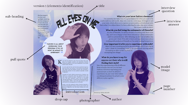
After cropping out my model image and choose the background, I started on designing my double page spread


Double page spread version 1 analysis 

I am not satisfied and not confidence with the results of my first version of this magazine due to several reasons:

- Poor colour scheme, it makes the whole design look unprofessional
- The filter chosen for my model images made the whole page look dull 
- Article content are not justified and not following the margin and borders, which makes the position of the text messy
- Poor choice of typeface used, too many styles are used
- Overall looks really rushed

I will try to create another version of my double page spread, but this time I will pay more attention to the colours I will be using, borders & margins and the typeface choice. I decide to not add too many elements in the page so that it is easier to read.

════ ⋆★⋆ ════
VERSION 2


Final double page spread design:

════ ⋆★⋆ ════

𝐂𝐨𝐧𝐭𝐞𝐧𝐭𝐬 𝐏𝐚𝐠𝐞 𝐑𝐞𝐬𝐞𝐚𝐫𝐜𝐡 & 𝐃𝐞𝐯𝐞𝐥𝐨𝐩𝐦𝐞𝐧𝐭

 Here is my contents page development for my magazine layout. 


┏━━━━━━━━━━━━━━━━━━━━•❃°•° Self-reflection°•°❃•━━━━━━━━━━━━━━━━━━━━┓

Creating the contents page took me the most time out of all my magazine pages, because I had too many ideas for the concept layout which makes me indecisive. To overcome this, after developing I tried to see which suits my front cover design. I wanted to take risks to think outside the box and subvert the common conventions of a fashion magazine. Although I would still include the basic elements of a contents page such as: page number, article name, article description, etc, I was thinking of changing the layout design of the whole page in which I've never seen in a magazine before; a paper receipt page. I loved the receipt paper design layout (version 3), but it was too difficult for me to execute them as I envisioned, so I decided to scratch the developing process.

┗━━━━━━━━━━━━━━━━━━━━━•   ❃°•°❀°•°❃   •━━━━━━━━━━━━━━━━━━━━━━━┛


Contents page research 

I researched tons of fashion magazine contents page references as well as other layout designs that I might use the idea to develop my contents page layout for my magazine, here are the results I've found (file below is embedded, click the right arrow to view other references / analysis): 

--------------------------------------------------------------------------------------------------------------------------------------------------------------------------------------------------

Sketch draft 

From the research that I've done, I then started sketching several possible layouts I can create for my contents page:


I will make sure to use similar or the same typeface or fonts with my front cover magazine to match the overall style. 

--------------------------------------------------------------------------------------------------------------------------------------------------------------------------------------------------

Contents page development 

VERSION 1 
Here is me experimenting with the TypeCraft tool to develop the title:


For my initial attempt, I tried to design a receipt layout, and to demonstrate that it is already frequently touched and viewed, I chose a texture of crumbling paper. Additionally, I experimented with a variety of backgrounds. In this case, I created a purple and white gradient and overlaid it with a plastic-like texture. I was hoping to bring attention to the point that grocery items are typically placed into a plastic bag after being purchased. The importance of the paper and the need for it to be remembered and understood are indicated by the paperclip that is attached to the upper left corner of the paper. I then begin by adding the page number, headline, and subheading after the initial layout. It does appear rather a bit stiff which makes it less realistic.


I attempted to include a line right below the page to indicate the total amount of pages in my magazine, which is something that readers don't really need to know—as well as the cover title, which is obvious from the front cover. I decided to delete them because I felt they didn't really fit and were too irrelevant.  


In an attempt to test how it would seem, I did another experiment and added a QR code (currently a barcode from my front cover magazine) so that readers could scan and view them online whenever they wanted. The entire arrangement still seems odd to me. 


Because of the unprofessional appearance of the version in the magazine, as well as the slightly tilted paper form that makes it difficult to measure borders and grids, I have decided not to use it for my contents page. Another issue is that I was unable to include any images of my model, which is unfavorable. I will attempt to create a new version of my contents page. 

════ ⋆★⋆ ════

VERSION 2 


From this progress, the position between the texts are still messy. After adding grids and margins so that my texts are aligned well, here is the final result:


════ ⋆★⋆ ════

VERSION 3


𝐅𝐫𝐨𝐧𝐭 𝐂𝐨𝐯𝐞𝐫 𝐋𝐚𝐲𝐨𝐮𝐭 𝐑𝐞𝐬𝐞𝐚𝐫𝐜𝐡 & 𝐃𝐞𝐯𝐞𝐥𝐨𝐩𝐦𝐞𝐧𝐭

Here is my magazine development of my front cover layout. 


┏━━━━━━━━━━━━━━━━━━━━━━━━•❃°•° Self reflection°•°❃ •━━━━━━━━━━━━━━━━━━━━━━━━━━┓

I really enjoyed developing the front cover layout as I can experience with different typefaces, colours and layouts to see which suits better. Creating rough sketches of my layout plan helped me to expand my creative thinking throughout the whole development process in attempt to deliver an effective message for my intended audience. Initially, I wanted to go with an elegant layout with the use of typeface that are seen sophisticated that feels very formal, classic and luxurious the moment the audience see the front cover magazine, but realised it didn't suit that much considering my target audience is for teenage girls.. This is due to my model's pose being less feminine. At the end, I'm keeping the same layout but change the typeface and colour to match the main image better. Additionally, in order to prevent any blandness from my whole front page, I added a hint of light purple to the main coverlines and masthead to emphasise the text to pop up more, but still making sure the model is still the center of attention. Developing an attractive front cover magazine is extremely crucial to create a good first impression from my audience when viewing the front cover when it is displayed later on, where other similar magazine designs are being showcased as well. Therefore, I need to create a design that is eye catching enough for the audience to be captivated and entice them to get to know my magazine further and dive into the content. I used my previous knowledge during class and self research regarding the essentials of a successful magazine by paying attention to details and every choice I made in order to achieve this. 

┗━━━━━━━━━━━━━━━━━━━━━━━━━━━•   ❃°•°❀°•°❃   •━━━━━━━━━━━━━━━━━━━━━━━━━━━┛

--------------------------------------------------------------------------------------------------------------------------------------------------------------------------------------------------
Barcode Research 
After some research, here is the type of barcode I typically find in magazines. The requirements for a barcode for magazines differ slightly from the standard UPC bar coding for other retail products. The reason for this deviation is that the magazine industry requires the ability to differentiate the different issues of a given year's magazine. The 12-digit barcode on the left is the standard UPC barcode, while the right side referred to as the periodical barcode or issue supplemental and identifies the issue of a given year. The supplement may be published either monthly (01-12) or weekly (01-52) depending on the issue.


--------------------------------------------------------------------------------------------------------------------------------------------------------------------------------------------------
Draft Sketches 
Here are the front magazine layout design sketches I have thought in mind:
--------------------------------------------------------------------------------------------------------------------------------------------------------------------------------------------------
Development 
Since I have did my title, masthead & typeface development for my front cover magazine in my previous blog post (can be found here: https://chelstirta-regentsmedia.blogspot.com/2023/10/magazine-development.html), I started on developing my front cover by combining all the elements I've researched. 

This is the main image (size: 148 x 210 mm) I will be using for my front cover in which I have edited in order to enhance the lighting and add a suitable filter to it. I make sure to add borders (10) so that all the elements I will add later will be aligned. 


From this part, I asked for suggestions and comments from my teacher to see what I can improve with this layout design. Since my main coverline is "The new fashion sensation: CHARLENE", I was told that it needs to be bigger so it will be the first thing that caught the audience's attention after the masthead. 


After further editing and final check, here is my final front cover magazine: