Thursday, October 26, 2023

๐“๐š๐ซ๐ ๐ž๐ญ๐ข๐ง๐  ๐€๐ฎ๐๐ข๐ž๐ง๐œ๐ž๐ฌ

Here are my notes and practices from a theory lesson in class about genre theory and how media companies target audiences through demographics and psychographics.


┏━━━━━━━━━━━━━━━━━━━━━━━━•❃°•° Self reflection°•°❃ •━━━━━━━━━━━━━━━━━━━━━━━━━━┓

I gained a better understanding of how to change a genre to target new audiences that I can use for my magazine project later on by conducting plenty of analysis practices regarding how different audiences are targeted through genre theory and demographics & psychographics. Working in a group discussion is beneficial to me because it allows us to discuss our different perspectives while analyzing the two magazines with different target audiences. My teammates may also suggest ideas that I hadn't thought of, which will help me apply this knowledge of critical thinking in the future. Since my group's research has shown that fashion and lifestyle are the main topics of my fashion magazine, I think this research will be especially helpful for it. Even though the magazines I've picked are aimed toward older women and men, I want to create a magazine that appeals to younger audience such as teenage girls, so I'll make differences, to use Steve Neale's words, to things like color, typeface, and star appeal. In addition, by doing the teacher's compulsory test, I can evaluate my performance more objectively and make improvements based on the teacher's feedback and recommendations, which will help me better target the audience of my magazine.

┗━━━━━━━━━━━━━━━━━━━━━━━━━━━•   ❃°•°❀°•°❃   •━━━━━━━━━━━━━━━━━━━━━━━━━━━┛

I worked as part of a group but participated in the discussion on how different genre of magazines target audience through demographics and psychographics (sorry that the notes are quite messy). 

Chosen magazine 1 - Cosmopolitan by Hearst Magazines, UK 2013

Chosen magazine 2 - GQ Conde Nast Publications, 2016 September


Results of notes analysis

--------------------------------------------------------------------------------------------------------------------------------------------------------------------------------------------------

I did another magazine analysis from the use of demographics and psychographics as a unit test assessed by the teacher. The question was, "How are audiences targeted by the media?". In answering the question, I used the case study comparison between a Teen Vogue magazine and Men's Health magazine. The image attached below was my paragraph answer, as well as comments and revisions added by the teacher. 


--------------------------------------------------------------------------------------------------------------------------------------------------------------------------------------------------

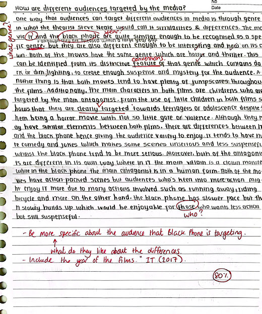
I did a practice assessed by the teacher regarding how different audiences are targeted by the use of genre theory by Steve Neale. The question was, "How are different audiences targeted by the media?". I used the case study of the movies "IT" and "The Black Phone". Below was my written answer.


Tuesday, October 24, 2023

๐Œ๐š๐ ๐š๐ณ๐ข๐ง๐ž ๐ƒ๐ž๐ฏ๐ž๐ฅ๐จ๐ฉ๐ฆ๐ž๐ง๐ญ

Here is the development process of my magazine, I will put all of my ideas here and reflect on the decisions that I made. 


┏━━━━━━━━━━━━━━━━━━━━•❃°•° Self-reflection°•°❃•━━━━━━━━━━━━━━━━━━━━┓

It took me some time to develop my magazine idea, as I never imagined it would be simple and quick. While I have some ideas for this development that I came up from my head, I also utilize the internet as a research tool to come up with more ideas by looking up synonyms for the words I came up with using a thesaurus. I struggled to select between all of the options I had, resulting me to slower my decision making in settling a magazine title and main cover line, but in the end, I went with the one that best fit the genre of my magazine. From this, I also have been contemplating whether I should continue making a fashion genre magazine because I was not sure on who to use as a model for my front cover. At the end, I choose my little sister as the star appeal, hopefully she'll be able to corporate, hence I tried to think of a with a simple and not overly complicated pose for my magazine cover so that she can follow along. 

┗━━━━━━━━━━━━━━━━━━━━━•   ❃°•°❀°•°❃   •━━━━━━━━━━━━━━━━━━━━━━━┛

Genre: Fashion
Sub-genre: Clothes/Outfits

------------------------------------------------------------------------------------------------------------------------------------------------------------------

Name of magazine: 
- Chenelle (combination of my name) (French: caterpillar → doesn't make sense)
- Rainelle  
- Branchรฉ (trendy → in French) 
- Chic
- Venust (beautiful, elegant, graceful)
- Beauteous (beautiful) 
- Mode
- Fad 
- Dernier cri (very latest fashion → in French) 
- Style
- Bewitched (enchant and delight) 
- Constellation 
- Luminous
- Stellar

There are several names that I am interest for my magazine name. I personally like the names Chenelle, Branchรฉ, Venust, and Bewitched based on all the names I came up with above. Because Chenelle is a combination of my name, "Chenelle", and the word "Rainelle," it may sound fancy, but the meaning somewhat didn't make sense because audience might interpret it differently considering the word "Chenelle" in French means "Caterpillar," which has nothing to do with my fashion magazine. For this reason, I decided against using Chenelle as the name of my magazine. Although the word "Branchรฉ" translates to "trendy," which is relevant to the genre of my magazine, I am unable to use it because my main target audience is in Asia. This left me with Venust and Bewitched as my final two options. The word "Bewitched" seems intriguing to me because it may imply that someone can be greatly attracted to or interested in you, giving you the power to influence them (as they were cast by a spell). However, I decided in the title "Venust" for my magazine. "Venust" an adjective derived from the Latin word "Venustus" which is the Greek goddess of beauty. I chose this word since it is an archaic synonym of beautiful / graceful / elegant, which is more in line with my fashion genre as it is used to describe someone that possesses qualities of beauty, elegance or attractiveness. This word may not be a common word or easily understood in daily lives for people, but it is actually begins with the name of the Roman goddess of love (Venus). 

------------------------------------------------------------------------------------------------------------------------------------------------------------------

Possible cover lines:
- Exclusive interview with (...)
- Fashion look-book 
- Secrets on healthy and clear skin
- (...)'s favorite essentials
- (...): Rising star 
- Skin that glows 
- Build confidence in yourself
- Fashion icon
- Ultimate fashion guide
- Self-discovery: Find your beauty
- What your (...) says about you 
- Rock your outfit in confidence 
- The new fashion sensation 
- (...); Music star 

For my magazine, I would like to use the main cover line, "Exclusive interview with (...)". Since my target audience is young teenage girls, I intended that my star appeal is well-known and is quite popular among them. Therefore, I thought that using an the sentence "exclusive interview" as my main cover line would draw in them, who look up to the star appeal as a role model. As a result, they would be curious to hear what the star appeal has to say in the interview especially when it is exclusive, meaning that it is more likely to appear on that magazine only (other sources cannot be found), as well as the audience would feel a connection with them.  

------------------------------------------------------------------------------------------------------------------------------------------------------------------

Images plan 
- A lot of images of my star appeal/model posing in different poses and wearing various clothing (most of the pages are using long shots)  
- The products endorsed by my star appeal (skincare products)
- Musical instruments (Piano, bass), my star appeal/model might also pose in playing those instruments 

Magazine cover image
My magazine cover image plan will be my star appeal/model posing from a high angle, with phone cameras around her as if she's the center of attention as a rising star. I would choose my sister as my star appeal to pose as the main subject, and I need the help of my other family members to do the taking pictures pose. A challenge is to find a stable and good lighting.

Double page spread
My initial idea of my double page spread is to feature a famous young celebrity (My little sister) posing by holding an electric bass, the angle might be eye-angle level or either her looking down at the instrument. I envisioned the main image will take up both of the page, positioned in the middle. I may include a few more small, additional close-up photos to further support my article. To make my double spread title immediately recognisable, I'll put it the title in the upper left corner with a large font size. To start my sentence, I would also like to include a drop cap. In order to create a modern sleek aesthetic, I aimed for my double-page spread to be purple and grey, which also happens to match the color scheme of my magazine's cover. 

------------------------------------------------------------------------------------------------------------------------------------------------------------------

Typeface title development 
Here are some of typeface ideas I've sketched that I want to use for my magazine


Here are the similar fonts I've found in the internet + analysis I did from the ones I've sketched 


------------------------------------------------------------------------------------------------------------------------------------------------------------------

Colour research 
This is the colour palette I'm going for: 
According to colour psychology, the colour purple is associated with the following words: wisdom, wealth, creativity and ambition. I would like to use this colour palette and incorporate them to my magazine.

------------------------------------------------------------------------------------------------------------------------------------------------------------------

Thursday, October 19, 2023

๐’๐ญ๐š๐ญ๐ž๐ฆ๐ž๐ง๐ญ ๐จ๐Ÿ ๐ˆ๐ง๐ญ๐ž๐ง๐ญ

Here is my statement of intent for my magazine, which outlines some of the main details of my magazine plan. It may change as my ideas develop, but this is my starting point.


Document link (in case the document isn't viewable): 
https://docs.google.com/document/d/1f6qiOKmaA2L60Lemddxxv2GVuCtu9wR-R6nvcFtS6sU/edit?usp=sharing 

┏━━━━━━━━━━━━━━━━━━━━━━━━•❃°•° Self reflection°•°❃ •━━━━━━━━━━━━━━━━━━━━━━━━━━┓

Having my ideas set out in detail from the beginning has really helped me to stay on track and keep my magazine within the genre and intended target audience, alongside guaranteeing that I know where I want my magazine to go. There are many times where I took an incorrect turn, in such that I planned to include an article for my fashion magazine that addresses music. Even though fashion and music have always had strong cultural ties and have greatly influenced and informed one another, I realized after reaching out with my statement of intent that this would not be suitable for my particular genre because it would require me to add additional information, which would make it more complicated. For that reason, I decided to remove that information.

┗━━━━━━━━━━━━━━━━━━━━━━━━━━━•   ❃°•°❀°•°❃   •━━━━━━━━━━━━━━━━━━━━━━━━━━━┛

Wednesday, October 18, 2023

Stuart Hall: Representation Theory

Here is a theory lesson regarding representation theory and stereotypes in Indonesian media analysis 

(not yet finished) 

What is a representation?

The representation theory is proposed by Stuart Hall, who argues that the reality or original subject has no fixed meaning, however when they are represented in the media, they are given a meaning to events, people, groups after the occurrence. Or in other words, media doesn't reflect meaning instead media creates meaning. Typically, the media tries to fix a 'dominant reading' of different events, people or groups but Hall argued in his reception theory that the audience doesn't have to accept this. 

What is a stereotype?

A stereotype occurs defined as the practice of reducing a group or an individual to a limited set of preconceived ideas that already circulate about this group in society. Stereotypes are a means of quickly constructing representation in an easily accessible way for the audience. Stereotypes are often created when a representation is repeated enough in a media.

Why stereotypes are used? 

Stereotypes are often used in a media as it makes it easier and quickly for the audience to interpret the meaning quickly when exposed to the media. They are also used due to the lack of diversity in the writing room or production. 

What are the social groups represented in the media? 

The social groups represented in the media are:  gender & sexuality, LGBT, race, ethnicity, religion, age, social class, disability and place (these are the different representations that are mostly used in the media).


Two social groups that are stereotyped in Indonesian media (1 positive, 1 negative) 

What is the group?

Religion 

How are they represented? (mise-en-scene, sound, etc) 

The majority of the Indonesian population are often Muslims; this reachers over 87%, which is 123 million. In Indonesian media especially what is shown in movies, Muslims are mostly shown and tend to be the main characters. They are usually presented as people being religious 

However though, in some times the media represents religion negatively as conflicts are often being made between religions in Indonesia.

What is the reason for this?


How does the audience receive this message? 

The audiences who've seen this representation in the media might think that people in Indonesia are religious as in movies, they often show them praying or doing their religion routine. 

Examples from media texts (images, screenshots, videos)

- News: Conflict between Muslims and Christians (Poso) 


link sources: 

- https://magdalene.co/story/wanted-better-representation-of-indonesians-on-films-and-tv/

- https://www.indonesia-investments.com/culture/religion/item69

- https://pewartafotoindonesia.or.id/2022/02/25/headline/memahami-representasi-dan-minoritas-agama-dalam-media/

Thursday, October 5, 2023

๐Œ๐š๐ ๐š๐ณ๐ข๐ง๐ž ๐‘๐ž๐ฌ๐ž๐š๐ซ๐œ๐ก

Here is the research for my magazine that are all related to my intended magazine genre. This blog page focuses on a general fashion genre of magazine covers and how they are usually displayed around the world, I have further & specific research on my other blog post.


┏━━━━━━━━━━━━━━━━━━━━━━━━•❃°•° Self-reflection°•°❃••━━━━━━━━━━━━━━━━━━━━━━━━━━┓

It took me quite awhile to conduct this magazine research because I had to analyse a number of magazines, both in-depth and broadly. This involved figuring out the elements of the magazine cover, target audience, relevant theories that can be applied (representation, uses and gratification), industry, media language, etc. Since I have limited physical magazines that fit my preferred magazine genre (fashion), I try to look up some of the most well-known magazines online and analyse them because most of them were released recently in comparison with magazines I have right now, which can give me more inspiration. Although the magazines I've analysed all belong to the same genre, they all differ from one another in distinctive ways, such as how they use typography, colour, layout, and other elements. This leads to some confusion for me when it comes to my magazine project later on because I wanted to incorporate most of the elements from each magazine, but combining them all won't produce a good harmony. I must therefore carefully choose which ones will complement my overall magazine design and be used as sources of inspiration.

┗━━━━━━━━━━━━━━━━━━━━━━━━━━━━•   ❃°•°❀°•°❃   •━━━━━━━━━━━━━━━━━━━━━━━━━━━━┛

--------------------------------------------------------------------------------------------------------------------------------------------------------------------------------------------------

I've noticed that magazines are displayed differently in other countries compared to the country I'm living in right now. Below are the pictures I took during my trip as well as an explanation on the purpose of this display. 

Here is what magazines are normally displayed in the UK:


And here is what magazines are normally displayed in Malaysia (Kinokuniya):


Finally, here is what magazines are normally displayed in Indonesian bookstores (Periplus): 


Overall, magazines must compete with one another for readers' attention. In store shelves, a magazine only has it's front cover to draw attention away from other publications and toward itself because there may be several titles within a same sub-genre that are similar to each other. Magazines are often arranged overlap in ways that make only the left or upper third visible to possible audiences.

--------------------------------------------------------------------------------------------------------------------------------------------------------------------------------------------------

Magazine 1 - A-ONE

A-ONE magazine is an Indonesian monthly magazine. 


Genre: Fashion, health & lifestyle 

Target Audience
Uses & Gratification 
Based on the theory of uses & gratification, there is a use of personal identity, where the magazine supplies with fashion role models and ways of understanding of their place in society. Another thing from this theory that is used is surveillance as the audience can use this magazine to gather information regarding health and beauty matters. 

Masthead/title
The name of the magazine is located on the top section written in a large and bold font which gives the magazine's title namely, 'A-ONE' hence making it easily recognisable for the audience when viewing the magazine even from far away or just a glance as it is the first thing the audience will read when picking up this magazine. 

Typography/font 
The typography used in the front cover have bold colors such as red, white and gold in order to make them more elegant, various types of fonts are used on the whole cover of the magazine to give variety. Regarding the publishing date and price of the magazine, small fonts are used which makes it more difficult to read so it doesn't catch the attention of the audience. 

Image
An image of a women (model: Malik Moestaram) dressed up with a bold red background is used as the main image of the cover, this will catch the audience's attention from the fancy and unusual clothing she's wearing. This is often linked to the main article or the feature within the magazine inside, which is outfits styling and fashion catwalks. 

Media language
The genre of this magazine is fashion hence the magazine tend to have images of models dressed up in fancy and unique outfits in order to attract the audience's attention. Conventions are used such as the use of eye-level angle to build a sense of connection between the audience and the main subject or star appeal on the cover.

---------------------------------------------------------------------------------------------------------------------------------------------------------------------------------------------------

Magazine 2 - Teen Vogue

'Teen Vogue'  is version of the 'Vogue' magazine, which is targeted specifically for teenage girls. The magazine is published within the U.S and releases an issue each month.

Genre: Beauty & fashion


Target audience


Uses & Gratification 
Based on the theory of uses & gratification, this magazine utilizes personal identity as teenagers especially girls would look up to their role model. Chloe Grace Moretz is widely known and quite famous among teenage girls. Hence, from her beauty and achievements she successfully inspire them positively to become better version of themselves.

Masthead/title
The title of the magazine is located on top of the front cover with use of colors of teal and orange, these colors are enough to grab teenager’s attention due to its bright and bold colors. 

Typography/font
The typography used in this magazine are in wide range of varieties and colors including bright and bold colors such as pink, teal, dark orange as their main color. This will make the magazine stand up more as easily catch teenagers attention from the usage of color and style of font which is more playful as well as colorful.

Representation
Teen vogue represented teenage girls as is 'flawless'. With teen vogue for the star appeal Chloรซ Grace Moretz, they have used Photoshop to make her completely flawless, beautiful and even to make them look thin. This then gives out the idea to all teenage girls who view these photos that these photo-shopped teenage girls and woman are what 'true beauty' look like, when really it is an unattainable beauty. This then negatively affects teenage girls as it gives them the idea and belief that they should be flawless and just as beautiful when in reality they would be unable to become as flawless as it unrealistic. 

Industry
Teen Vogue is owned and published by Condรฉ Nast, an American media organisation that publishes around 20 magazines including Vogue, GQ and Wired. The company targets a wide range of different audiences with 164 million consumers across its brands. Although Teen Vogue has been creating headlines for its political content in recent years, it is also an important part of the fashion industry. Both editorial content and advertising is designed to create a strong desire in their audience for products featured. This links to Condรฉ Nast’s role as a major media company interested in maximising profit.

---------------------------------------------------------------------------------------------------------------------------------------------------------------------------------------------------

Magazine 3 - Vogue 


Target audience
For demographics, it is targeted towards women in the ages of 25-35 with its star appeal Priyanka Chopra. On the other hand, for psychographics is for the audience who are mature and interested in beauty and love. 

Analysis
✮ Like: The use of white colored font to make them stand out from the dark background. 
✮ Dislike: All the fonts in the cover lines are too similar and same except the masthead, therefore I won't be incorporating them to my magazine because I would prefer use different fonts for the cover lines.
✮ Steal: I would like to position my masthead on top of the magazine, specifically behind the main image.
✮ Inspired by: My main image of the front cover magazine wll face directly to the camera but not on eye-level. 

---------------------------------------------------------------------------------------------------------------------------------------------------------------------------------------------------

Magazine 4 - Elle


Analysis
✮ Like: I like the creativity used in the front cover because the main subject is using props. 
✮ Dislike: It seems kind of empty due to limited cover lines and it is only positioned on the right side of the magazine.
✮ Steal: My main subject will be in a sitting down position (but high angle).
✮ Inspired by: I would like to use props for the main subject of my main image.

---------------------------------------------------------------------------------------------------------------------------------------------------------------------------------------------------

Magazine 5 - Frรคulein 


Analysis
✮ Like: I really like the simplicity of the magazine but still attractive to be looked at.
✮ Dislike: Less cover lines so the audience won't know what the contents of the magazine are.
✮ Steal: To use borders (image not full page).
✮ Inspired by: Gradient but soft background. 
---------------------------------------------------------------------------------------------------------------------------------------------------------------------------------------------------

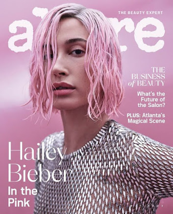
Magazine 6 - Allure 


Analysis
✮ Like: The outfit and makeup matches the background (pink). 
✮ Dislike: The masthead 'Allure' is covered by the main subject hence makes it more difficult to read.
✮ Steal: Add cover lines around the subject.
✮ Inspired by: Match the colors of the main image and background so that it looks appealing to be seen.
---------------------------------------------------------------------------------------------------------------------------------------------------------------------------------------------------

Here is a link to my double page spread research + development 
https://chelstirta-regentsmedia.blogspot.com/2023/11/double-page-spread-research-development.html 

๐–๐ž๐ž๐ค๐ฅ๐ฒ ๐๐ซ๐จ๐ ๐ซ๐ž๐ฌ๐ฌ & ๐๐ฅ๐š๐ง

Here is my weekly progress for the magazine project. I also did a rough plan for my project which will give me an idea of what tasks that I need to finish by a certain timeframe, and the progress report will give me a chance to reflect on my actions and what to improve from those weeks.


Week 

Term 2

Week 

Term 3

1

(2 Oct)

Brief, Research

8

( 8 Jan)

Development

2

Research

9

Shoot

3

Research

10

Shoot, Self Reflection

4

Proposal 

11

Post Production

5

Development

12

Post Production

6

Development

13

(12 Feb)

Deadline (Monday 12th February)

7

Development

14


┏━━━━━━━━━━━━━━━━━━━━━━━━•❃°•° Self reflection°•°❃ •━━━━━━━━━━━━━━━━━━━━━━━━━━┓

Making a weekly progress is extremely beneficial for me as it ensures that my progress is on track and as a reminder on what tasks I should complete according to the plan. Also, starting from week 4 I decide to change the structure of my weekly progress and plan to become more reflective and easier for me to differentiate between the tasks I've done, problems I've encountered and how I solve them, as well as the to-do list I have to finish. Throughout the semester, I discovered that creating a progress & plan and consistently filling them up every week has increased my accountability to complete tasks and evaluate how well I performed in completing the project. I gradually came to understand how important this blog page is because it keeps track of everything I've done and what I should accomplish, particularly when a deadline is approaching.

┗━━━━━━━━━━━━━━━━━━━━━━━━━━━━•   ❃°•°❀°•°❃   •━━━━━━━━━━━━━━━━━━━━━━━━━━━━┛


SEMESTER 1
─── ・ 。๏พŸ☆: Week 1 :☆๏พŸ. ───
During week 1 the teacher introduces to brief of the component 1 magazine project, as well as magazine terminologies. This will help me a lot for my final magazine project because it will give me a sense of direction on what to do and expect when creating the project. Then we did a practice on identifying the features of the front cover of our chosen magazine. I should've choose another magazine as the language is all in Japanese, hence not easy to understand and identify.

─── ・ 。๏พŸ☆: Week 2 :☆๏พŸ. ───
Throughout week 2, we are introduced to representation theory by Stuart Hall, this can be useful for my magazine as I should be careful in representing my subject on the magazine cover. We start collecting magazines and begin analysing them in detail, this would help me to further understand what is included in a magazine and help me to gain inspiration for my final magazine project later on. For next week my goal is to finish all the big and small analysis, as well as preparing the rough idea of my magazine project. 

─── ・ 。๏พŸ☆: Week 3 :☆๏พŸ. ───
In week 3, we continue learning about representation as well as stereotypes theory. I then tried to finish my magazine research (2 big covers and 4 full magazines) and start creating my statement of intent. I need to work on my time management more because I haven't finished the magazine research, this is because it took me such a long time to find the magazines I wanted to use and analyse as the magazines that I currently have are quite difficult to analyse due to the lack of elements that are included as well as the magazines genre are not related to the final magazine project that I want to create. To encounter this problem, I decide to search for more magazines online so that it is easier for me to get inspiration for my final magazine project and understand better on what a typical fashion magazine looks like. Additionally, I decide to change the format of my weekly progress to be more reflective starting on next week by using the structure of tasks, problem, solution and to-do lists.

─── ・ 。๏พŸ☆: Week 4 :☆๏พŸ. ───
Tasks: During theory lesson, I learned about genre theory by Steve Neale and how demographics and psychographics affect the audience. These theories are important in order to choose an appropriate target audience through my chosen genre and demographics/psychographics. On the other hand, during project lesson and my spare time I tried finishing my magazine research and statement of intent, then starting on my magazine development. Creating a magazine development is an important step for me so that I have a clear and specific plan on what my magazine will look like as a whole. 
Problem: A problem I encountered is finding a suitable title for my magazine name, because I have many ideas and it is a challenge for me to choose the right one for my magazine project.
Solution: I tried to find synonyms of basic words that is related to my magazine, then choose which suits best. 
To-do lists: I need to organise and arrange my blog posts in general as the layout still looks messy. I also need to finalise my magazine research, development and statement of intent in case I need to add more relevant information. 

─── ・ 。๏พŸ☆: Week 5 :☆๏พŸ. ───
Tasks: During this week we did a review of the key concepts of media studies by making a mind map/poster in a group, then we shared the information to our groups through gallery walk in turn. By doing this, it refreshes our memory on the key concepts discussed in media studies that can be used in our magazine project (e.g. effect theories, representation theory, etc). Furthermore, during project lesson we started on analysing the magazine double page spread that is related to our magazine genre later on.
Problem: I attempt to copy paste the table analysis to my blog, but some of the texts are unorganized and out from the table. 
Solution: In order to solve this problem, I tried to make another copy of the file, then edit the table myself so that the borders are neat. This allows me to copy the table neatly to my blog. 
To-do lists: I need to finish my magazine double page spread research (2 magazines and images of the double page spread). 

─── ・ 。๏พŸ☆: Week 6 :☆๏พŸ. ───
Tasks: In week 6, we learned about new media which is the means of mass communication using digital technologies. I also received my test score on section B (how different audiences are targeted in magazines). In addition, I finished my double page spread analysis and starting on creating the magazine article draft for my double page spread.
Problems: While making my magazine article draft, I had troubles on what to write as well as finding a suitable and catchy headline and sub-heading to attract and engage readers. 
Solutions: To cope with this problem I tried to find inspiration and references online, this would help to get the picture or an idea regarding the content to write. 
To-do lists: I need finish my magazine article draft as soon as possible. 

─── ・ 。๏พŸ☆: Week 7 :☆๏พŸ. ───
Tasks: During week 7, I tried to re-check and complete all my blog posts and make sure that each post is in the blog (this includes: brief, weekly progress & plan, research, statement of intent, magazine development, targeting audiences, double page spread, technical skills, terminology, location scout and article 1st draft), has label, self-reflection and all complete. I have given a checklist so that it is easier for me to finish all without double checking whether I have done that certain task or not. 
Problems: I had no idea on how to arrange the posts to their desired position.
Solutions: To resolve this issue I tried to search on the internet on how to arrange those posts by changing the date published.
To-do lists: Search possible locations (minimum 3) for my magazine cover during the holidays.


SEMESTER 2 
─── ・ 。๏พŸ☆: Week 1 :☆๏พŸ. ───
Tasks: I received suggestions and comments from my teacher regarding the magazine blog and contents I submitted, this really helped me to understand what I should add, edit or improve to achieve a good result. After collecting photos for my location scout during the holidays, I start doing the blog post of location scout and risk assessment. Other than that, I changed the blog layout in order to meet Cambridge's guidelines so that it is easier for them to read and assess.
Problems: Because I took many pictures for one location, I wanted to put them side by side, which became a challenge for me because blogger.com may have limited ability to do so.
Solutions: I go on to other application to combine the images, save then add to my blog.
To-do lists: Finalising my blog design as the layout is now changed.

─── ・ 。๏พŸ☆: Week 2 :☆๏พŸ. ───
Tasks: During week 2 we did a layout tutorial, where the teacher provided as default magazine layout and asked us to arrange the layout. We were also taught regarding the important elements in designing. Furthermore, we did a practice on shots and poses for our magazine.
Problems: While revising my magazine layout practice after the lesson about the importance of layout, I find difficulties in finding the grid guide in google draw (as I've never used this application before) so that all the positions of my magazine elements are aligned and pleasing to look at.  
Solutions: In order to resolve this issue, I tried to explore the features of google draw and finally found the button where it says 'show ruler', in which I have to drag the line from the ruler horizontally or vertically as I wanted. 
To-do lists: Finish blog post of magazine layout tutorial as well as magazine development, start shooting the pictures for my magazine at January 26-27, 2024. 

─── ・ 。๏พŸ☆: Week 3 :☆๏พŸ. ───
Tasks: In week 3 I started on with the magazine development, I used my previous knowledge in class about magazine layouts and incorporate them to my development and experiment using different layouts, fonts and colours used so that my front cover magazine looks appealing. 
Problems: It took me so much time to find a suitable font for my front cover magazine because it plays a huge role for the whole magazine look.
Solutions: I sketched my ideas on paper and find similar fonts on the internet so that I already know what font to use so that I can manage my time more.
To-do lists: I need finish my magazine development (front cover, content and double page), and get my front cover shoot done as soon as possible. 

─── ・ 。๏พŸ☆: Week 4 :☆๏พŸ. ───
Tasks: During week 4 we were introduced to the critical self reflection (what to include inside) and starting to brainstorm as well as creating the creative presentation. 
Problems: It took me some time to brainstorm my self reflection as I need to fully comprehend what each compulsory questions mean for me to answer in detail and effectively.
Solutions: Whenever an idea comes up I tried to write them down in bullet points so that it is easier for me to identify the main points and further develop them into paragraphs.  
To-do lists: Since I finished doing my magazine shoot, I need to sort out the pictures I think is applicable to be used in the magazine and edit them if necessary. 

─── ・ 。๏พŸ☆: Week 5 :☆๏พŸ. ───
Tasks: In week 5, we started on editing the final pictures from the photoshoot, creating the front cover magazine and organising the layout I want it to be. 
Problems: Some of the lightings from the pictures I took are quite dark and low quality, which doesn't look professional to be looked at.
Solutions: I tried several editing apps so that I can improve the lighting of the photo better.
To-do lists: Finish final front cover, contents and double page by next week, ask teacher for feedback.

─── ・ 。๏พŸ☆: Week 6 :☆๏พŸ. ───
Tasks: During week 6, I start developing my front cover page, researching & find initial idea for my contents page as well as double page spread. I researched inspirations in the internet that I might use for my magazine later and developed my own design layout to them. 
Problems: A problem I've encountered is that there was a ceremony held near our school, hence the time for this lesson got cut due to it, meaning that I have less time to develop my magazine design.
Solutions: In order to overcome this problem, I tried to do this task as a homework at home so that when I come to school I already have ideas in my head and get straight into designing or planning the layout for my magazine.
To-do lists: I have so many things to do next week, which are to finalise my magazine front cover, contents page and double page spread. Those are the things that I need to prioritise first. The other ones that I need to do is just fixing the layout for my blog and revising the posts.

─── ・ 。๏พŸ☆: Week 6 :☆๏พŸ. ───
Tasks: Week 6 is one of the most crucial week of all, this is because I have to finish all three of my magazine pages (front cover, contents and double page spread), including both research and development. I also realised that some of the blog posts are still not fully completed along with the self-reflection in which I need to get that done as well. I tried to use my time efficiently so that I can finish everything on time and achieve a satisfying result. 
Problems & solutions: 
- Considering that I have multiples of pages for my magazine research, it was a burden for me to save all the pictures then pasting them onto my blog individually because of how time consuming it was. Therefore, I decide to embed the file link to my blog which makes it more easily readable and more neat as you only need to click the right arrow to view.
- After conducting my research, it took me some time to figure out which layout design I'm going to choose so I asked my peers for suggestions and evaluate both pros and cons of each layout design.
- It can difficult to achieve the right proportion for the spacing of my magazine, hence it is important for me to use grids and borders. 
- Whenever I think my designs feels off and stuck (not knowing what to do or edit), I asked my teacher and friends for comments on what can I improve. This would enable me to feedbacks and advice on how I'm doing so that the outcome won't be biased by their honest opinions (not just mine, as sometimes it might appear okay to me but not to others since we might perceive things differently).