Here is the final product of our music video, digipak and social media.
𝐌𝐞𝐝𝐢𝐚 𝐒𝐭𝐮𝐝𝐢𝐞𝐬 ❀ 𝐂𝐡𝐞𝐥𝐬𝐞𝐚 𝐓𝐢𝐫𝐭𝐚
Tuesday, March 11, 2025
Final Product
Monday, March 10, 2025
Critical Reflection
In accordance with the Cambridge brief for Component 3, students are expected to create a music promotion package of an album, including a music video, an official social media page for the artist and a digipak. My group and I decided to create a fictional 19 year old Indonesian female pop musical artist with a bold, feminine and flirty personality named “Cinta Kyle” along with her album and debut song called “The Weekend” originally by BIBI and 88rising. Her songs often revolve around the portrayal of complex love relationships, hence it is targeted towards teenagers to young adults aged 16-25 years old.
Branding that is consistent is a crucial element for the artist’s identity in order to create a unique image that resonates with the audience and to create a long lasting impression, therefore conveying an effective message across our products that reflects our main theme of love. We decided to incorporate colours that resonate with this such as maroon red and white, which ends up becoming our brand’s primary colours. This colour combo is used as a signature for her confidence and passion. In association with Cinta’s bold personality, we deliberately styled her in black skirts, red tops along with high-heeled boots, connoting powerful femininity and love. Her distinct style’s can be seen in her digipak cover and her music video’s main performance outfit. Her kiss trademark featured in her CD cover is a feminine touch which symbolises love and passion. Combined with the heart symbol as her main logo along with scenes gesturing the heart, adds up to her flirty personality on screen persona. The use of cursive lettering across all products also reflects her femininity and elegance, enhancing her artist identity, which further aligns with her romantic and emotionally expressive image. By using the same colour scheme, fonts, tone, and style across our thumbnail and the whole video, we further improve recognition and encourage viewer familiarity and interaction (Fig. 1).
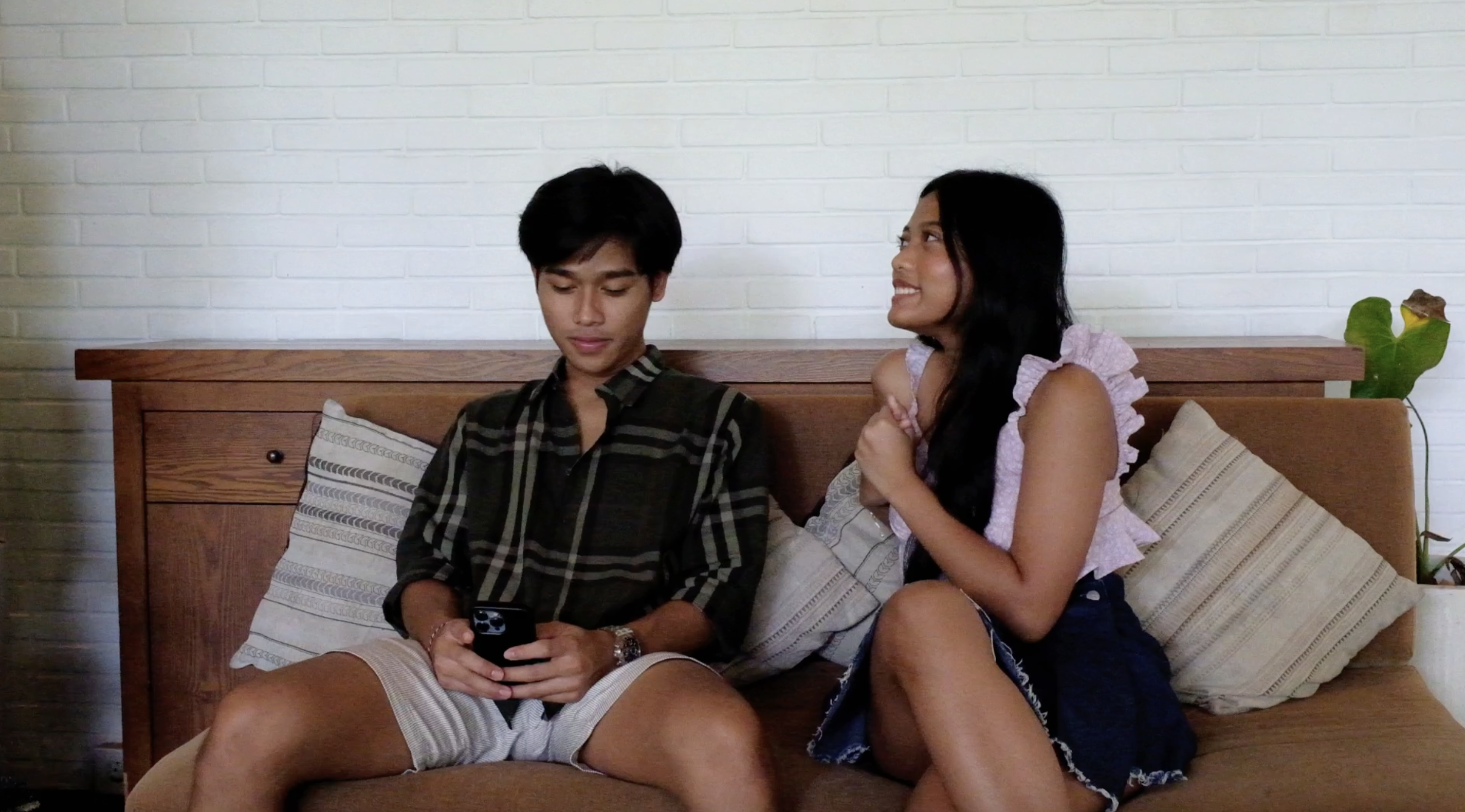
Conducting research on several music videos allowed me to understand the conventions of a pop music genre. We combined both narrative and performance based concepts to make the music video entertaining and engaging to watch. Our narrative of how she was once a lovergirl but realised throughout her toxic relationship that the only person she could hold on to is herself and did not need validation from other boys, aimed to highlight two aspects of the artist’s persona: innocent (pink outfit, pajamas) and playgirl (red bold outfit, red alcohol cup). We followed the conventions of mostly upbeat and fast-paced clips such as quick cuts and match cuts to evoke energy and excitement. Another convention we followed was the usage of direct mode of address, across the music video, digipak and social media, in which the artist looks straight at the camera (Fig. 1.1, 1.3). This could serve as a way of developing a connection between the artist and the audience, in line with Bulmer and Katz's uses and gratifications theory of social relationships. We used creative editing techniques in relation to subvert, including the match cut in the scene where the artist stumbles from being ‘tipsy’ and falls on the bed in her PJs (Fig. 2), implying the duality of her persona. The POV shot in which the artist attempts to locate the boys using a heart cutout to search her potential partners (Fig. 3). In this way, it creates a feeling of intimacy with the audience as if they were experiencing it with her, therefore keeping them engaged.
We primarily focused on how South East Asians are being portrayed, which are commonly underrepresented. Considering that our main target audience is also South-East Asians, casting all people in this race would make them feel seen and affirmed when they see themselves being portrayed in the media, which is linked to the Uses & Gratification theory by Bulmer & Katz of personal identity. Furthermore, issues such as unrequited love and toxic relationships are commonly discussed in this modern society. The mirror shot in the digipak (Fig. 4) may symbolise emotional distance and the desire to be seen. We tried to subvert how men and women are usually portrayed; males are frequently referred to as "players" and often being in control, which usually implies they are insincere, manipulative and untrustworthy. However, we attempted to reverse their roles to show that women can also hold positions of power and control a relationship, aligning with Van Zoonen’s feminine discourse theory, which argues that gender representation in the past is more simplistic, but as time evolves it has become more varied as masculinity and feminine ideals have changed overtime. In this instance, the evolving representation of women has made them more dominant. This is evident in the music video, between the artist and the main love interest (dark-coloured plaid shirt and 'clean' look, representing ‘bad boy’ and disguising his toxic side) (Fig. 5) and between her and her potential (failing) love interests (white T-shirts) (Fig. 6), suggesting that they are simply "background characters" in her narrative, who have no significance for her.
We also researched and implemented the conventions of a pop music genre digipak. We heavily took inspiration from Sabrina Carpenter’s album cover, which includes a simplicity of the design and the medium close-up of the artist in the front cover, which gives the album identity and makes it easily recognisable for the audience, along with other features like the title, artist identity, tracklist, production company, copyright and institutional information, which helped us conform to the generic conventions of digipak for pop music genre. Front covers typically have plain backdrops. Our background is unique since we select a simple background that conveys the essential information rather than images relating to the artist. Similar to the narrative concept, where she appears uninterested and unbothered with her ultimately failing love interests (wearing white clothing), the artist may be the centre of attention due to the large amount of white space surrounding her, while others may appear dull and boring. The usage of maroon red and a cursive typeface is seen as feminine in order to appeal to our demographic, which encourages self-assurance and empowerment. Furthermore, a strong confidence and empowerment is set by the posture and how the star directly gazes at the camera. The pose chosen shows a flirtatious vibe of the star, which is seen as seductive and elegant, whereas the direct mode of address is used to build connection and emotional bond with the audience, boosting engagement (Fig. 1.1).
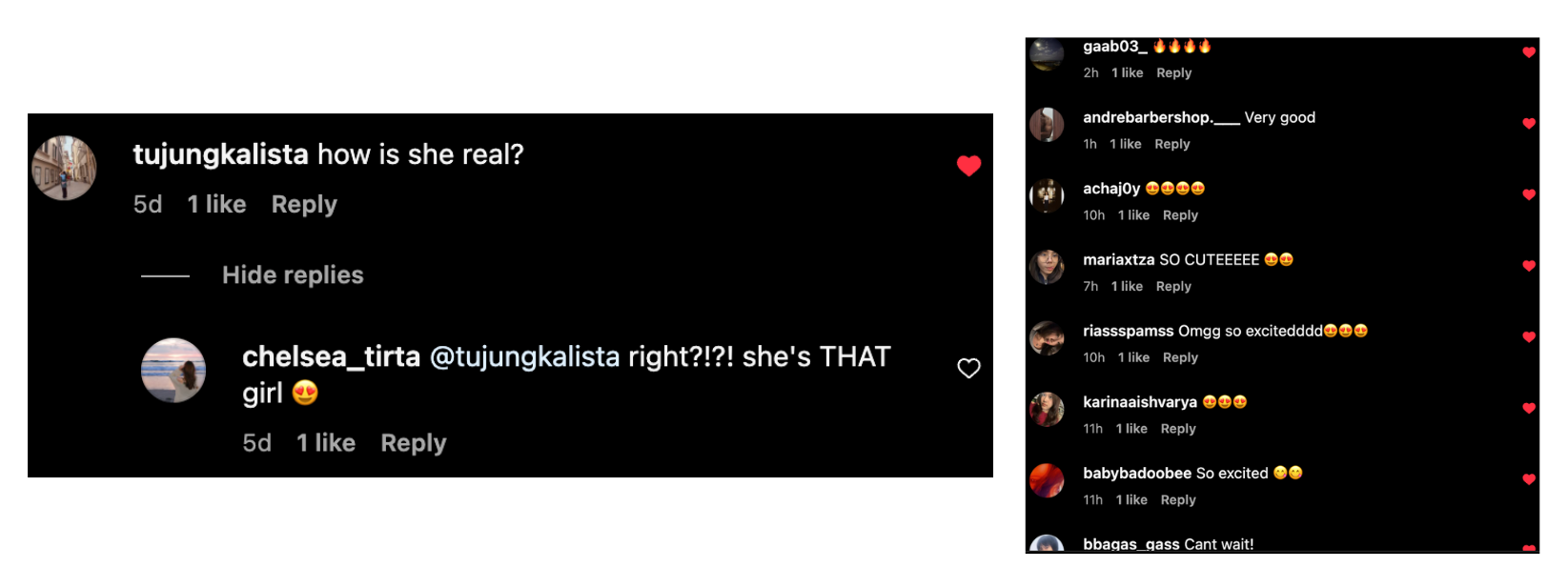
The rise of new media has made it easier for our artist to promote her music and increase audience engagement across various social media platforms like Instagram, Youtube and Linktree (Fig. 1.2, Fig. 7, Fig. 8). We will offer unfiltered, raw moments of Cinta, while also boosting promotional content, such as ‘Elle’ magazines with a similar target audience to ours, in an effort to portray her in a professional and personal way. To make the artist seem more approachable and genuine, informal selfie profile photos and behind-the-scenes photos (Fig. 9) are used to create relatability and authenticity. Her personal side of life fosters a deeper connection with the audience, such as her highlights of outfit inspirations, where the audience can be inspired and gain confidence and personal identity from her fashion, in line with David Gauntlett’s identity theory, where the audience uses media to represent themselves. According to Clay Shirkey's theory of end of audience, audiences are no longer passive and expect interactive media; for this reason, we use interactive stories by collecting and responding to fans’ questions using the question box feature (Fig. 10). Moreover, responding to comments establishes a direct connection between the artist and fans, which creates a sense of community. The fandom theory by Henry Jenkins supports this, as the comment section helps fans to interact with one another to express excitement and reactions for her upcoming album release, as well as giving support towards the artist herself (Fig. 11).
Overall, I feel that our music promotion package was successful in portraying our main star, Cinta Kyle, as we have effectively achieved the dominant reading of confidence and self-empowerment across all of our products. Through the consistent tone and visuals throughout the music video, digipak and social media, we are able to establish a strong and cohesive artist identity, enabling audiences to connect with Cinta Kyle as an empowering female artist.
![]() |
Fig. 1 (1.1 - Digipak cover, 1.2 - Social media feed, 1.3 - Music video performance, 1.4 - CD cover) |
![]() |
Fig. 2 - Match cut (2.1 - Tipsy, 2.2 - PJs) |
![]() |
Fig. 9 - Social media post |
![]() |
Fig. 11 - Audience interaction (10.1 - Audience to audience, 10.2 - Audience to artist) |
Media Language Usage
Here is a blogpost which I created a presentation that breakdowns the media language & technical elements used in our music video. This blogpost is written by me (Chelsea).
┗━━━━━━━━━━━━━━━━ ━ ━━━━━━━━━━━• ❃°•°❀°•°❃ •━━━━━━━━━━━━━━━ ━ ━━━━━━━━━━━━┛
Clothing Analysis
Here is a blogpost explaining the usage of clothing in our music video. This blogpost is written by me (Chelsea).
┗━━━━━━━━━━━━━━━━ ━ ━━━━━━━━━━━• ❃°•°❀°•°❃ •━━━━━━━━━━━━━━━ ━ ━━━━━━━━━━━━┛
Sunday, March 9, 2025
Social Media: Research & Development
Here is the social media research and development for our main artist. This blog post is written by me (Chelsea) and my teammate (Kalista). There are also additional information (development) I've written myself (Chelsea) for further explanation.
₊˚ ✧ ━━━━⊱ RESEARCH ⊰━━━━ ✧ ₊˚
Below are the artists' social media (Instagram page) we choose to research from our genre: BIBI and Sabrina Carpenter. We choose these artists in particular because they are pop artists who share similarities with our main artist, who we also chose as a pop artist. Pop artists typically follow similar social media page conventions, particularly when a new song or album is released. As a result, we can draw inspiration from them and create our own social media content in line with their style, but also different enough to create our own branding and uniqueness to our musical artist.
BIBI Social Media Research (made by Chelsea):
┏━━━━━━━━━━━━━━━━━━━━━•❃°•° Self reflection°•°❃ •━━━━━━━━━━━━━━━━━━━━━━━┓
Before we create our own social media account for our main star, Cinta, it is crucial that we conduct researches of the social media accounts of famous pop artists, especially on Instagram, as this will help us understand what methods work best for engaging audiences and developing a strong artist identity. By analysing how these pop artists present themselves online, we can identify the key trends and audience expectations. This will help us to create an engaging social media presence for our own star, while shaping a unique identity that still fits within the pop genre. We also choose artists that create similar content from which we can draw inspiration from.
Researching this is fun and enjoyable for both of us since we can annotate any important notes to be pointed out. While each of them has a huge fan base, it is also easier for us to analyse how their audience interacts with the artist and other fans. Since we found lots of inspiration and ideas to implement (especially from Sabrina Carpenter), this helped us to make informed decisions when developing our star's online presence, thus I hope that this research will be helpful when we develop Cinta's social media account, ensuring that it feels relevant and appealing for our target audience to successfully relate to and connect with.
┗━━━━━━━━━━━━━━━━━━━━━━━━━• ❃°•°❀°•°❃ •━━━━━━━━━━━━━━━━━━━━━━━━━┛
For our main star’s social media, we would like to use several platforms to reach a wider audience and increase accessibility to our targeted audience. Below are the social media platforms that we considered to use:
- We specifically choose Instagram for our star’s main social media page, this is because it allows us to communicate with our main target audience which would be teenage girls (the popularity of this platform may also boost audience engagement and to grow a fanbase). Instagram's platform layout also helps us to maintain a consistent aesthetic, which is a key in shaping a memorable and professional artist identity.
- We also will consider utilising Youtube specifically for long videos such as the music video itself, behind the scenes video and if possible, a teaser video to generate audience's excitement. Posting the artist's music video in this platform will help us to further increase visibility since it is the go-to platform for audiences as it is free, easily accessible and helps them to discover, watch and share content across all devices.
- We will use Linktree as a supporting medium where audiences could have easier access to star’s social media in one page. It allows us to share multiple links (music, socials (Instagram, Youtube, Spotify, X, Tiktok, etc), (if possible) merch) through one single URL, which helps to boost engagement and accessibility to our target audience.
- ACCOUNT NAME
We made sure to include our artist's name “Cinta Kyle” or “Cinta”. This is because we want to make her profile easier to find, which boosts recognition and strengthens brand identity.
Below are our list of ideas:
@cintaaa (simple & catchy)
@itscintakyle (classic celeb style)
@callmecinta (cool & casual)
@cintakyle (clean & simple)
@cintakylee (informal & casual)
@whoiscintakyle (mysterious, intriguing & cool)
@callmecintakyle (confident & casual)
@notcintakyle (playful, trendy)
@cinta.official (classic artist handle)
@dearcintakyle (intimate & unique)
@cintakyleofficial (formal)
@cinta_xx (xx for kisses, cute loving)
@cinta.xoxo (fun & affectionate)
@xoxocinta (loving)
After a discussion together (with the group as well), we highlighted some of the choices above and analysed further to help us with our artist’s final account name. We also checked if the username we wanted is taken or not in Instagram since it is not possible to have more than one of the same username in the app. Below, Chelsea checked the availability for each possible username combinations (✅ = available, ❌ = not available):
✅ @itscintakyle
❌ @callmecinta
❌ @xoxocinta
❌ @xoxo_cinta
❌ @xoxo.cinta
✅ @xoxo.cintaa
✅ @xoxocintaa
✅ @xoxo_cinta
✅ @xoxocinta_
According to us, the use of “_” or “.” in an artist’s username is not considered professional. Therefore at the end, we have decided to use the name @itscintakyle, in which we think it is a strong username because it feels personal, memorable and authentic. The "its" adds a casual and conversational tone, as if she is introducing herself, creating a friendly and approachable vibe. Moreover, the username we chose is simple, easy to spell and consistent with her artist identity, so we think it is great for her brand recognition across different platforms.
- ACCOUNT DESCRIPTION
An account description is important to help create a strong first impression to our target audience, where the artist is introduced or guides them to their products (music video, digipak & other links). For our star's account description, we've thought about 2 ideas shown below:
The Weekend out now! 💋
OR
Xoxo,
Cinta 💋
Since her trademark distinguishes her from other artists, we have considered using the kiss emoji (💋) to her description so that audiences may easily recognise her. It also creates a flirtatious and confident tone — exactly what we want to establish for our artist — and allows her to express her personality in a quick and fun way using only emojis.
We ultimately choose “The Weekend out now! 💋” for our artist’s description to promote her newly released album. The use of short phrasing and an exclamation mark creates a sense of urgency and grabs audiences' attention easily. By this, it keeps the focus on her music while also reinforcing her brand identity in a fun and engaging way.
In contrast, "Xoxo, Cinta 💋" may feels more warm and personal, however, it does not promote any of the artist's latest release or allowing audiences to engage further. We all thought that it works well for her general branding, but not in the context of promotional efforts.
- PROFILE PICTURE
Overall, here is how our artist's Instagram profile look like:
- PLANNING & BRAINSTORM
Following discussion, we've chosen to include 12 posts to our artist's Instagram account. In order to show her development as a new artist, we want to highlight her life prior to her debut in the first bottom postings. Gradually, her branding will become more noticeable in the more recent posts. Here is our draft list of ideas (We apologise for the messy handwriting).
- POSTS DEVELOPMENT
- Travel pictures will portray the artist's lifestyle as adventurous (loves travelling) and cultured which helps audience feel connected by showing her real life "behind the scenes".
- Travel pictures will increase engagement and aesthetic appeal since pictures like these are visually appealing (especially the landscapes and holiday spot locations) that attract high engagement from fans.
- The star is sharing her hobbies, as sharing on their personal interests helps them connect with audience beyond their professional lives which makes celebrities feel more real and down-to-earth.
- Pilates reflect self-discipline, self-care and confidence which supports our artist's persona.
- We want to show that she's not not just about music, but also wellness and lifestyle which adds depth to her branding.
- A tracklist can build excitement and engagement since it increases anticipation and hype from fans who have been waiting for the song / album release. We believe that it will invite them to discuss, predict favourites and share their excitement.
- The tracklist design will support our artist's branding and aesthetic appeal, in which ours include lipstick marks and handwritten style. This creates a romantic and personal feel, reinforcing the artist's image and theme of the album itself.
- We also choose to create a tracklist post for marketing strategy. By teasing song titles, the artist generates curiosity. By this, fans may speculate on meanings, leading to word-of-mouth promotion through discussions on social media.
Caption chosen: The phrase we have chosen is carefree and confident that matches our artist's bold and attractive personality. The intentionally used the disco ball emoji "🪩" to emphasise the party and nightlife vibes, while the heart on fire emoji "❤️🔥" to emphasise her passion.
- It positions her as a star on the rise, which makes her feel belong in the world of pop culture and fashion.
- We believe the magazine design layout helps to elevate her brand identity (bold aesthetic) which reflects back to her styles, values and personality.
- We also believe that it helps to boost engagement as audiences can repost, save and share this magazine-styled post since it may feel premium and inspiring.
- We specifically choose one of the famous magazine brand, ELLE, since it is globally recognised and shows legitimacy. We also wanted to create a contrast (since her last post is her singing karaoke with friends, and the next day she's in ELLE), which makes her feel relatable and aspirational at the same time.
- We wanted to showcase behind-the-scenes to remind the audience that behind the final, polished music video is someone real, fun and hard-working by showing images like laughing, messing up or vibing with the cast.
- We feel that this type of content can build stronger connection with audience, since fans undoubtedly will love feeling like they're in on the process. So, after viewing the final music video, it gives viewers a deeper emotional connection to the product.
- SLIDE 1 (Selfie in front of mirror during shooting): A mirror selfie conveys confidence (like she's owning her image and moment), and mirrors (literally) her MV's theme of self-reflection and identity.
- SLIDE 2 & SLIDE 6 (Photo of a scene through the camera's screen): This photo gives a director's eye view, in which fans will feel like they're getting an exclusive sneak peek into what the camera sees vs. what they see.
- SLIDE 3 (Main artist and her on-screen love interest): This highlights the contrast between the on-screen toxic relationship and real-life friendship. They're both seen smiling to the camera, while Cinta (main star) leans a bit towards Darrel (main love interest), showing chemistry off-screen.
- SLIDE 4 (Artist, the cast, a crew holding a clapboard): They are all smiling to the camera, which captures joy during filming, thus we wanted to post this wholesome moment. This also shows appreciation towards the team.
- SLIDE 5 (Ending scene: smiling to the mirror): Other than it looks visually appealing, it reminds the audience of the final MV moment, which extends the emotional impact it had.
- SLIDE 7 (BTS of karaoke scene: smiling with friends): This expands her personality as a social, fun and down-to-earth person, the impression we want to make is "she's a popstar but also your favourite party girl"
- SLIDE 8 (Holding a heart cutout origami): One of the most memorable scenes from the music video, and we wanted to show a photo of the process.
- To reinforce her visual identity and style, so by regularly showing her outfits, audience can get a more clear idea of how Cinta express herself and her personality through fashion and styling choices.
- Mirror fit checks will make her relatable and trendy because our target audience (teenage girls) loves doing them themselves as well.
- Aligns with Bulmer and Katz users & gratification theory of personal identity, where audiences may relate to her fashion sense and aspire to be like her through her style.
- Channel name: "Cinta Kyle Official" the full artist name makes it easier to recognised when searching, the official adds up to the professionalism and ensure that this is the real account (not fan pages or fake accounts).
- Videos: We posted Cinta Kyle's official music video (to grab attention and increase visibility) as well as the behind-the-scenes (to build loyalty) to maximise audience reach and build emotional connection.
- Profile picture: A professional close up picture of the artist to make her easily recognisable so that audience can instantly identify who the channel belongs to (Similar to famous pop artists like Sabrina Carpenter, Taylor Swift, etc).
- Channel description: The Weekend out now! 💋 highlights her latest release for people to stream, and a Linktree that gives audience one place to find all her other platforms (explained further below, Linktree section).
┏━━━━━━━━━━━━━━━━━━━━━•❃°•° Self reflection°•°❃ •━━━━━━━━━━━━━━━━━━━━━━━┓
While Audrey and Rara are in charge of research and development for digipak, I (Chelsea) and Kalista are in charge of social media research and development. Since I can utilise my creativity to create creative and engaging content that would encourage audience involvement on our page, I would say that I find this process to be rather enjoyable. Making a Google Spreadsheet has also proven to be quite helpful in helping us plan more efficiently and keep track of everything we post or don't. In order for both of us to contribute, my teammate and I divided up the work of scheduling and creating the postings. We also made sure to get feedback from our other teammates and one another on if the content was appropriate before posting. They first gave their approval when we showed them the mockup of our Instagram page, but after we started posting, they decided it would be preferable to make some changes. As a result, we had to remove the posts and repost them. Even though it took longer, I came to understand how crucial open communication is for everyone to work together more effectively and accomplish the results we all want. In the end, I believe that our main artist's entire social media page has effectively reached and connected with our target audiences since every account information, posts and caption are carefully considered and intentionally picked for certain reasons. We also created engaging and unique content that people can resonate with. Additionally, I think that our artist's branding is highly strong because it uses colours (a specific shade of red), visuals and tone to create branding that is immediately recognisable across our other products (music video and digipak).
┗━━━━━━━━━━━━━━━━━━━━━━━━━• ❃°•°❀°•°❃ •━━━━━━━━━━━━━━━━━━━━━━━━━┛